Julie Snow is a terrific architect. But you might not know it from her website. Say you’d like to see her residential projects. From a series of tiny images darting across the bottom of the screen, you have to pick the ones that look like houses, and click before they disappear—like playing a video game. Simultaneously, the words “transparency enclosure veiling lightness structure detail assembly material surface performance technology transformative connection release” also dart about, as if to make the video game harder. And if you want to just pick up the phone, well, try finding the contact information.
|
|
BIG’s website is whimsical yet difficult to navigate.
|
Snow says her site is almost 15 years old—an eternity in web years—and that it has served her well during that time. (And she is in the process of developing a new site, she says, having heard the criticisms before.) Meanwhile, she’s in very good company.
Some of the best architects have websites that are flashy but dysfunctional. “Too many architects see their websites as design projects rather than marketing projects,” says Richard Staub, a marketing consultant based in New York. Sites that are too complicated to use may send a subliminal message: This firm cares more about how things look than how they work.
If you’re a superstar, it’s OK to play hard to get on the web. Frank Gehry’s website doesn’t have a single photo. Nor does SANAA’s site, a “splash page” listing the firm’s e-mail addresses. But that’s more information than you’ll find on Maya Lin’s site. Lin has struggled to make time to create large-scale artworks; it’s perfectly reasonable that her website has no contact information. Besides, she isn’t close to the most reclusive designer on the web. That might be Peter Zumthor, who has no site at all.
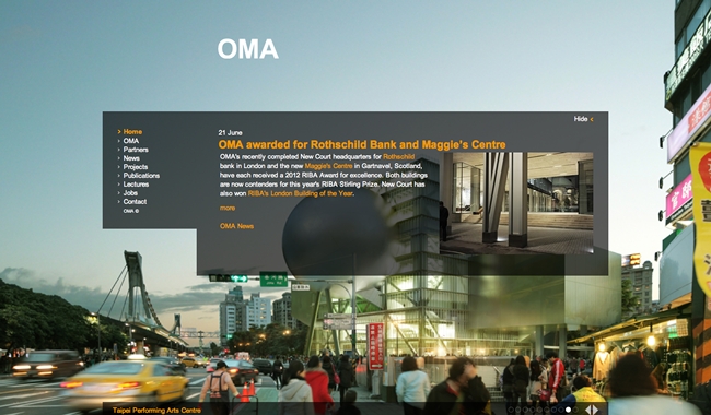
But what works for Gehry and Zumthor isn’t going to work for a young firm. Nor is the intellectual approach taken by OMA, whose site recently opened with a photo of Rem Koolhaas and Hans Ulrich Obrist interviewing a Japanese Metabolist. Of sites loaded with architecture-speak, Staub says, “Sometimes, I can’t tell if they’re talking to potential clients, or to other architects.” Staub believes a website should explain in plain English—almost like a well-written résumé—how the firm addressed the challenges of each project.
Sites that have too many bells and whistles generally employ the animation software Flash. But Flash content takes time to load. (Potential clients may not stick around.) And it doesn’t always show up in search engines. According to Kristen Richards, the tireless promoter of architecture through her website archnewsnow.com, people (whether journalists or potential clients) searching for architects may miss Flash-dependent sites. Not only that, Flash content doesn’t load on most mobile devices—a final nail in the coffin.
A few architects have gone to the other extreme, creating home pages without photos. That’s true for Leong Leong Architecture in New York, whose home page is words-only (although the rest of the site offers images). True, the words are beautifully arranged—the site was designed by the polymath Marc McQuade, a project architect for David Adjaye who also takes on freelance work. “In a time when we’re so saturated with flashy images, I was interested in testing the inverse,” he says. The Leongs say they might add visuals once they have more work to show.
Another trend among young firms is to incorporate blog-style news feeds. That works if you’re BIG, the Bjarke Ingels Group, which seems to make news every day. But if you don’t have that much to announce—and who besides Ingels does?—the format may fall flat. And don’t even try it if you don’t have somebody to keep the site updated. In early June, the “news” tab at stanallenarchitect.com pointed to a blank screen. (This writer is sympathetic: I haven’t updated my own website in years.)
But the most important thing, in the post–phone book era, is that people be able to reach you. Emulate Antoine Predock, who provides complete contact information for his Albuquerque, Los Angeles, and Taipei offices on his firm’s home page. And list the e-mail addresses of actual people at the firm: If you want to reach the director of development at Morphosis, the website directs you to Kim Groves (k.groves@morphosis.net). By contrast, if you want to reach someone at Elkus Manfredi Architects, in Boston, you are asked to fill out a form and hit “send,” not knowing if there’s anybody at the other end.

Post a comment to this article
Report Abusive Comment