LY: Another problem with the former design is that people had trouble finding the galleries upstairs. When did you first notice this?
MH: In 1924, when they placed the earliest galleries and period rooms on the top floor. It was always a problem for people to get to the beginning of the sequence. The principal goal of our effort was to clarify patterns of access—pathways for visitors. And the 1980 design did not solve the linkage issue between the 1924 structure and the rest of the building. At that time, they tried to integrate the wing with the main building, but it didn’t work: It was confusing, people got lost. In this redesign, the original building has been more fully isolated: The visitor stays within the American Wing structure, and the links to other parts of the building have been clarified.
KR: In 1980, we designed the wing hoping people would enter through the bank facade, with an elevator beyond that to bring people to the upper floors. But people never went through the bank facade; they didn’t see it as an entrance. Gradually, the main entrance became the door to the right of the bank, although it was not intended to be.
LY: So you expanded that entrance and added a new glass elevator where all the levels connect.
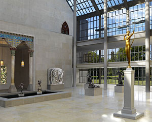
MH: The large glass elevator is the key to the new circulation pattern. It slices through the building, like a physical section of it, so you can see where you’re going. And by making it transparent, visitors on the ground level can see people going to the upper floors and follow them.
KR: The elevator is placed at a point of entry to each of the levels, and enables you to go directly to each floor: You can go to the period rooms without going through paintings, for example. Before, it was difficult to get to one area without going through another, and you had to detour or go up or down levels to get to specific galleries. Now the elevator gives you direct access.
LY: The elevator is a large, notably Modern glass-and-steel structure set amid objects from earlier periods. Did you choose it for aesthetic or merely functional reasons?
MH: The elevator was the result of our having experimented with every other imaginable option, including an escalator.
KR: We didn’t want to design a “period” elevator, but we discussed the possibility of using a vintage elevator cab that was available from a building that was being torn down. We considered it, but we decided not to. We chose to create a Modern elevator, and we decided not to close it up, but to make it transparent so people could see where they were going.
MH: We made the whole building transparent: We took down the concrete parapets on the balconies and put up glass railings; we removed a masonry wall in front of the elevator, so you can look from the elevator to the courtyard; and we have created vistas.
KR: Yes, we are creating vistas. But the full effect won’t be evident until the second floor is finished [in 2011]. It will be spectacular: When you come out of the elevator, for instance, you will have a long-distance view of [Emanuel Leutze’s] Washington Crossing the Delaware—from across the room! The final effect will only be clear when the painting galleries open.
LY: The use of glass for its transparency as a wayfinding tool is a theme of this project, but Garry Leonard has also noted that “it is the quietest, most neutral material that could be used structurally and wouldn’t get in the way of the art.” Do you think that museum architecture that calls attention to itself can serve art?
KR: Some recent museum buildings fail because their designs make it virtually impossible to show art. The egocentric nature of that architecture may be good for architecture, but not for art. But it should be possible to serve the purpose of a building without compromising architecture. If you’re designing a museum in a place where there isn’t a major collection and want to bring people there and get publicity, then it’s legitimate to create a building that gets them the press. But the Metropolitan is celebrated for its collections, not its building. In this case, you try to celebrate the collections in the most discreet way without compromising your values in architecture.
MH: This is architecture in the cause of art.
Post a comment to this article
Report Abusive Comment