St. Luke's School Expansion by ABA Studio
New York

The architects, ABA Studio, placed the expansion to St. Luke’s School on top of the existing two-story base at the corner of a block in Greenwich Village. To unify the old and new, the firm playfully incorporated Post- modern motifs that bring to mind the work of James Stirling and Michael Graves.
Photo © Durston Saylor

The actual entrance to the school is through a gate next to St. Luke in the Fields Church.
Photo © Durston Saylor

A small garden leads to the school’s existing entrance.
Photo © Durston Saylor

ABA Studio’s expansion fills out the upper stories; on the north end, facing a playground, is a 2010 classroom addition with a white curvilinear roof, designed by Barry Rice Architects.
Photo © Durston Saylor

The upper floors of the school are supported by large interior trusses so the expansion doesn’t weigh on the existing 1955 structure. These exposed elements enliven classrooms, hallways, and the gym.
Photo © Durston Saylor

The upper floors of the school are supported by large interior trusses so the expansion doesn’t weigh on the existing 1955 structure. These exposed elements enliven classrooms, hallways, and the gym.
Photo © Durston Saylor

The upper floors of the school are supported by large interior trusses so the expansion doesn’t weigh on the existing 1955 structure. These exposed elements enliven classrooms, hallways, and the gym.
Photo © Durston Saylor

On the garden side, ABA Studio converted a former gym to a theater and added a brick loggia in front of existing classrooms, resting on a squat column.
Photo © Durston Saylor

Image courtesy ABA Studio

Image courtesy ABA Studio

Image courtesy ABA Studio

Image courtesy ABA Studio
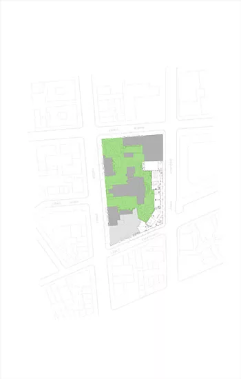
Site Plan of St. Luke’s School Expansion, Greenwich Village, NY.
Image courtesy ABA Studio
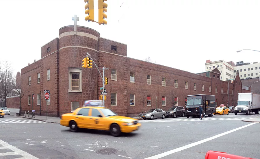
Before photo of the school building taken from the corner of Christopher and Greenwich Streets.
Image courtesy ABA Studio
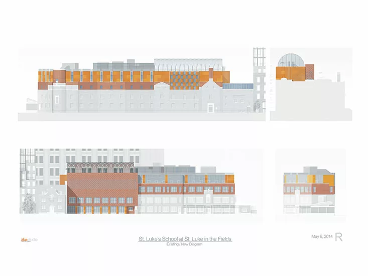
Elevation drawings of new and old construction; the Greenwich Street elevation (top), and garden entrance elevation (bottom).
Drawings © Danielle Eads/ABA Studio
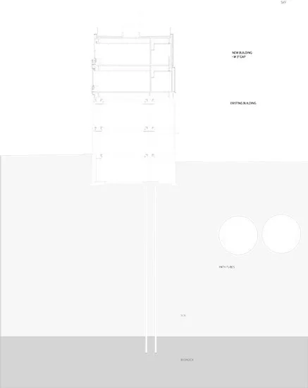
Transverse section of the building foundations in proximity to PATH tubes.
Image courtesy ABA Studio
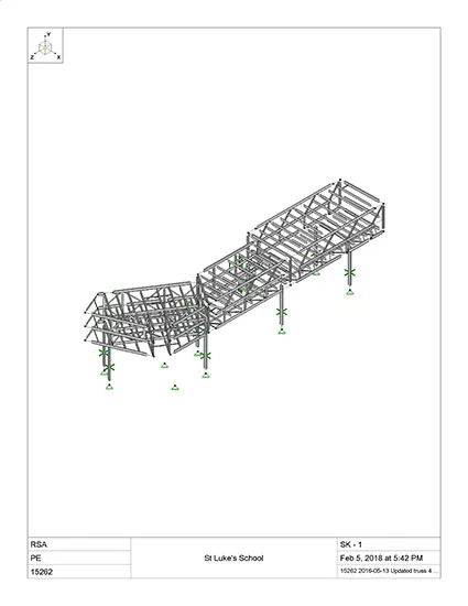
Truss diagram #1 for St. Luke’s School Expansion by Silman.
Image courtesy Silman
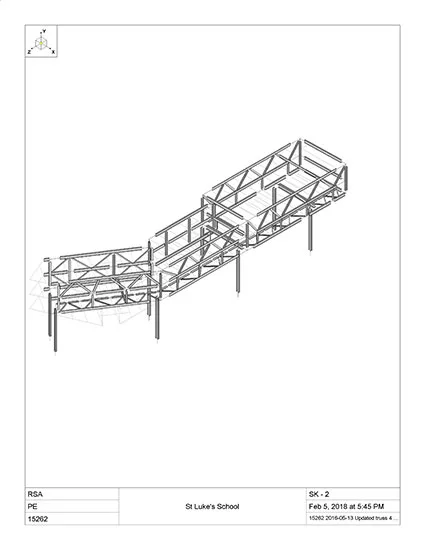
Truss diagram #2 for St. Luke’s School Expansion by Silman.
Image courtesy Silman
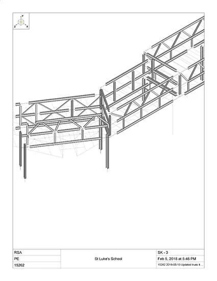
Truss diagram #3 for St. Luke’s School Expansion by Silman.
Image courtesy Silman
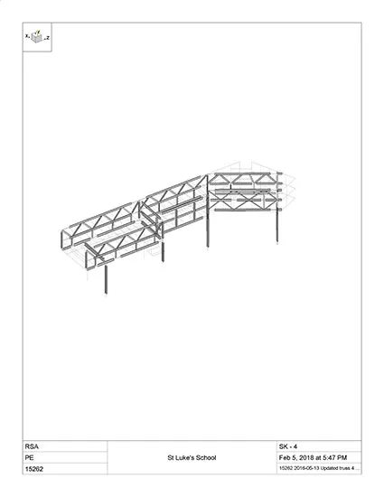
Truss diagram #4 for St. Luke’s School Expansion by Silman.
Image courtesy Silman
Architects & Firms
Often architects, given the opportunity to expand and renovate a building, leave their own signature in the most obvious way—up front. Watch out for the splashy new entrance, a blockbuster lobby, and a grand stair.
But Andrew Bartle of ABA Studio in New York faced a challenge more than an opportunity with his addition to St. Luke’s School in New York’s Greenwich Village. A few years ago, the private institution came to the architect to expand its K–8 facility, which sits in a complex containing St. Luke in the Fields, a Federal-style brick Episcopal church (1822). In addition to the two-story brick school built in 1955, an attached gymnasium, originally used by the church and dating to 1929, would be part of the renovation. A small, single-story classroom pavilion with a white curvilinear roof, which Barry Rice Architects appended to one end of the school in 2010, would remain. The L-shaped school itself is pushed into the northwest corner of the block-long site where it occupies its own quiet precinct, with the main entrance facing an interior garden rather than the street. The clients and the architects decided to keep the entrance where it was, discreetly away from the busy city: students enter a gate next to the church and meander through the leafy enclave to get to class.
Additional Content:
Jump to credits & specifications
Bartle wanted to double the size of the school to accommodate 270 students without disturbing the tranquility of the setting. (The site is within the Greenwich Village Historic District, which seeks to preserve the low-rise, brick character of the neighborhood.) His solution called for placing a 19,000-square-foot, two-story expansion atop the entire existing structure. Originally designed by Thomas Bell, the fortress-like brick entity has a round drum at the corner that acts as a linchpin for its short and long arms. Though technically the rear of the stolid mass, bound by two intersecting streets, those two “arm” elevations became the main attraction. In combining the two new upper stories with the original as the base, Bartle looked to a historicist vocabulary to provide a sense of order and continuity—and he did so with playfulness and wit. The architectural efforts of the 1980s jauntily haunt his elevations like revered ghosts from the past: Bartle has created a colorful, gridded pattern of brick and cementitious panels that bring to mind James Stirling’s and Michael Wilford’s Postmodern Clore Gallery at the Tate in London (1985). “And there is a whiff of Michael Graves in the colors and details,” adds Bartle, who studied architecture with Graves at Princeton University in the late 1970s. Since a renewed interest in Postmodernism appears currently on the rise in design exhibitions and architecture schools (where it has long been anathema), this strategy seems timely.
The architect’s attention to the surface materials is a case in point: the brickwork changes from a traditional running bond of the original base to a more modern stacked bond, with a gridded alignment of stretchers in the upper portion. He highlights the juncture between the original school and its expansion with a horizontal “zipper” bond: the headers slightly protrude as they alternate with the stretchers. As important is Bartle’s introduction of cementitious rainscreen panels in various shades of blood-orange that visually lighten the top two levels. Similarly, the fenestration patterns vary in rhythm like a riff on the 1950s Italian Rationalism of Aldo Rossi and Georgio Grassi.
Adding the two floors for classrooms and a new gymnasium on top of the existing building proved to be a serious engineering effort. Tunnels for the PATH regional transit system were close by, making it difficult to place foundations to accommodate new construction. With the help of Silman, the structural-engineering firm, the architects decided to use a series of steel trusses, the largest of which is 23 feet high (for the gym) and spans 90 feet, while others are 12 feet high with shorter spans. “The whole building is a truss,” says Silman’s Justin Den Herder. To keep the loads from being placed on the existing building, the team installed eight jumbo columns, 45 feet high, which were threaded through the older structure; they in turn sit on minicaissons extending 85 feet down to bedrock. Here Silman isolated the foundations from the columns to mitigate vibrations of passing underground trains. A public school might have nixed the complex engineering solution for this $20 million construction project. But St. Luke’s understood that expanding on top enabled it to stay within the existing footprint.
Inside, the architect exposed the trusses in the gym, the classrooms, and along the single-loaded corridor, painting them a bright yellow or green. “This is our ornament,” says Bartle. The trusses will be filled in with bookshelves and benches. The result is a building that from the outside actually hides its structural ingenuity but acknowledges the historic architectural character of the neighborhood. An homage to the Postmodern movement on the exterior, it is intensely modern on the interior by virtue of the exposed trusses.
This “inside/out dichotomy” provides a clue to the architect’s familiarity with the principles of Robert Venturi, laid out in his influential manifesto, Complexity and Contradiction in Architecture (1966). Yet the architecturally minded may think another Venturi phrase is even more apt: “the obligation toward the difficult whole.” Venturi maintained that a “difficult unity” could be achieved through bringing multiple and diverse elements together in a continuous entity. St. Luke’s collage of fragments achieves an overall order that is fresh and a bit brash. Bartle and his team have shown that you can reexamine the past and glean the best of its lessons to apply to the present.
CreditsArchitect: ABA Studio, 37 West 20th Street Suite 1201, NY, NY, 212-206-8929, www.abastudio.com
Personnel in architect's firm who should receive special credit: Andrew Bartle AIA Principal-in-Charge; Sean Auyeung RA Project Architect; Karl Jensen RA, Danielle Eads, Joanne Graney, Kenneth Lake AIA, Erik Orhman RA, Nicole Reamey RA, Catharine Pyenson AIA RA Design and Project Team
Interior designer: ABA Studio
Engineers Structural: Silman Geotech/Foundations: Mueser Rutledge Consulting Engineers MEP/FA/SP: Thomas Polise Consulting Engineer, P.C. Civil: Bohler Engineering Elevator: Van Deusen and Associates
Consultants Owner’s Representative: Seamus Henchy and Associates Expediter: Municipal Expediting Lighting: Horton Lees Brogden Lighting Design Acoustical: Lally Acoustical Consulting Theater: Fisher Dachs and Associates Wayfinding/Graphics: Emphasis Design Specifications Writer: Robert Schwartz and Associates
General contractor: Archstone Builders LLC
Photographer: Durston Saylor |
SpecificationsExterior Cladding Masonry: Belden Brick Company, Glen-Gery Brick Metal panels: Pac Clad Metal/glass curtain wall: Kawneer Glass block: Eastern Glass Block Rainscreen: Swisspearl Precast concrete: Vestacast Curtain wall: Kawneer Other cladding unique to this project: Trex Roof Guardrail: Ametco
Roofing Built-up roofing: Siplast Elastomeric: Johns Manville
Windows Wood frame: Bieber Windows Metal frame: Traco
Glazing Glass: Old Castle
Doors Entrances: Kawneer Glass doors: Blumcraft Wood doors: Mohawk
Hardware Locksets: Sargent Closers: Norton Exit devices: Sargent Pulls: Hafele Other special hardware: Dorma
Interior Finishes Acoustical ceilings: Armstrong, Tectum Suspension grid: Armstrong Paints and stains: Benjamin Moore Paneling: Claridge (cork wall panels) Plastic laminate: Formica Floor and wall tile: DalTile, American Olean, Resilient flooring: Armstrong Carpet: Interface Raised flooring: Action Floor Systems Special interior finishes unique to this project: Window rollershades: DFB
Furnishings Classroom Chairs: Smith System Desks: Smith System Lockers: Hallowell Gym Equipment: Gared Gym Divider: Gared Displayboards: Claridge, Egan
Lighting Interior ambient lighting: Finelite, Lumenpulse, Prudential, Louis Poulsen, Downlights: Acculite, USAI, Exterior: B-K Lighting, Lightology Dimming system or other lighting controls: Wattstopper
Conveyance Elevators/escalators: Precision Elevator
Plumbing Toilet: Kohler Sinks: American Standard Water Fountains: Elkay |
Looking for a reprint of this article?
From high-res PDFs to custom plaques, order your copy today!


