As case studies go, a pop-up-style kids clinic by Utrecht firm Tinker Imagineers exemplifies what clients can gain when designers think outside the typical floor plan’s boxy shape. When kids’ obesity clinic, the Centre for Overweight Adolescent and Children’s Healthcare (COACH) at Maastricht UMC+ hospital, was displaced by a renovation, Tinker built a whimsical installation of easily disassembled wood sheds, hexagonal privacy pods, and colorful foam furnishings in its temporary building. The effect of the active design on patients and practitioners was so positive that the clinic has opted to dismantle it, transport it, and re-install it back in their permanent renovated space.
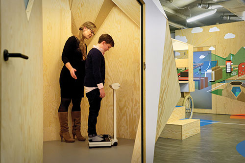
A painted wood pod, instead of an exam room, offers privacy for a weigh-in.
Given the clinic’s mission to get patients moving, there was really no contest between Tinker Imagineers inviting indoor village and the clinic’s previous space. Before the concept clinic was complete and ready for use, COACH had been welcoming patients in the main building’s unremarkable rooms and sharing common areas with other departments. Staff even had to schedule consultations around the main hospital’s functions, and restrict patient visits to the end of each day when traffic to other departments through the narrow corridors was winding down.
Rather than continue that practice after the facility was updated, Tinker convinced the hospital to reconsider its programming for COACH’s spaces and to embrace a design more in line with the center’s mission of helping kid patients stay active.
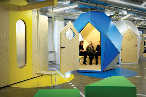
Pods with seating provide space for family consultations.
“The regular hospital setting was giving the children the wrong signal from the beginning,” says Ralf Lambie, an industrial designer who serves as Tinker’s art director and helms its healthcare practice. “It was imperative to get out of the hospital environment.”
With a project budget of roughly $525,000, Lambie and his team proposed using the temporary space for a trial run of their active solution inside a nearby administrative building.
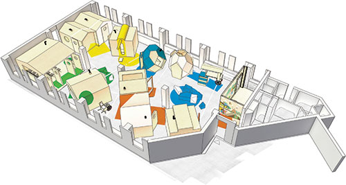
With modular furniture by FEEK Coated Foam, which uses a polyurethane-based lacquer to coat custom-shaped foam, and a series of pavilions and privacy booths built from brightly painted plywood, Tinker turned consultation rooms and exam areas into a vast playscape, even incorporating an electronic gaming system in its walls.
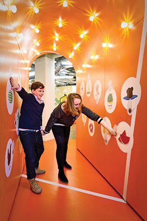
Embedding a touch-activated game into partition walls encouraged patients to move rather than sit while waiting to see health practitioners.
The waiting room was reimagined as “an open square where children are allowed to walk around and start playing straight away,” says Lambie. Engineers wrote software for an interactive game embedded in the walls and operated by touch; the goal is to identify healthy foods by pressing buttons in the wall, which activate lights. The center of the floor plan essentially became a game board.
Painted pavilions with doors provide privacy for appointments, weigh-ins, and dietary consultations. Children seem more attentive in conversations with doctors after playing, compared with their energy after sitting in a traditional waiting room, according to Dr. Anita Vreugdenhil, the founder of COACH. Staff also seem more enlivened. Making it all simple to disassemble was always part of the design, to make easy for practitioners to imagine re-installing in the updated building. “People get inspired by the environment,” says Dr. Vreugdenhil, noting staff have begun hosting meetings with policymakers, CEOs from private companies, and other healthcare professionals at the center. “The effect on the children was more or less to be expected, but the effect on the professionals is a huge additional yield,” she says.
This story was featured in Material World, Architectural Record’s products-focused newsletter. Subscribe today!


