Continuing Education: Building Recladding
For three moribund buildings, new envelopes restart the clock

As commercial buildings of the mid-20th century dwindle in market appeal, it’s often their facades that are showing their age. Technical components fail; contemporary performance expectations outstrip what earlier materials and methods achieved; a change of program calls for a change of look; an aesthetic expression no longer appeals to the market. Meanwhile, the core structure typically remains sound, and the resources it embodies—energy and carbon emissions, money, labor—retain their value. For a growing number of buildings, recladding can help reap fresh value from structure and site, improve performance and marketability, and launch a whole new lease on life.
Recladding has long been a way to upgrade energy efficiency, save on structural material costs, and architecturally rebrand, says Will Babbington, principal with structural engineer and facade design firm Studio NYL, but the greater flexibility and fewer unknowns associated with new builds have typically tipped the balance in favor of new construction—until recently. “Now increased awareness (and verification) of energy performance and embodied carbon have led to these factors’—along with occupant comfort—becoming design drivers that compare in importance with cost and aesthetics,” Babbington says. “Combined with advances in methods to measure and manage designs towards these goals, the industry is seeing a significant increase in reclads and facade retrofits.”
Three recent recladding projects exemplify this trend. A Gensler-designed overhaul of 100 Stockton, in San Francisco, has enabled a former department store to find new life as a multi-tenant building. KPF’s reskinning of 660 Fifth, in New York, has repositioned a flagging office tower as Class A space. And Snow Kreilich’s modernization of the Arthur J. Altmeyer Federal Building, in Woodlawn, Maryland (in collaboration with HGA), has transformed a miserable midcentury office block into a comfortable and desirable workplace.
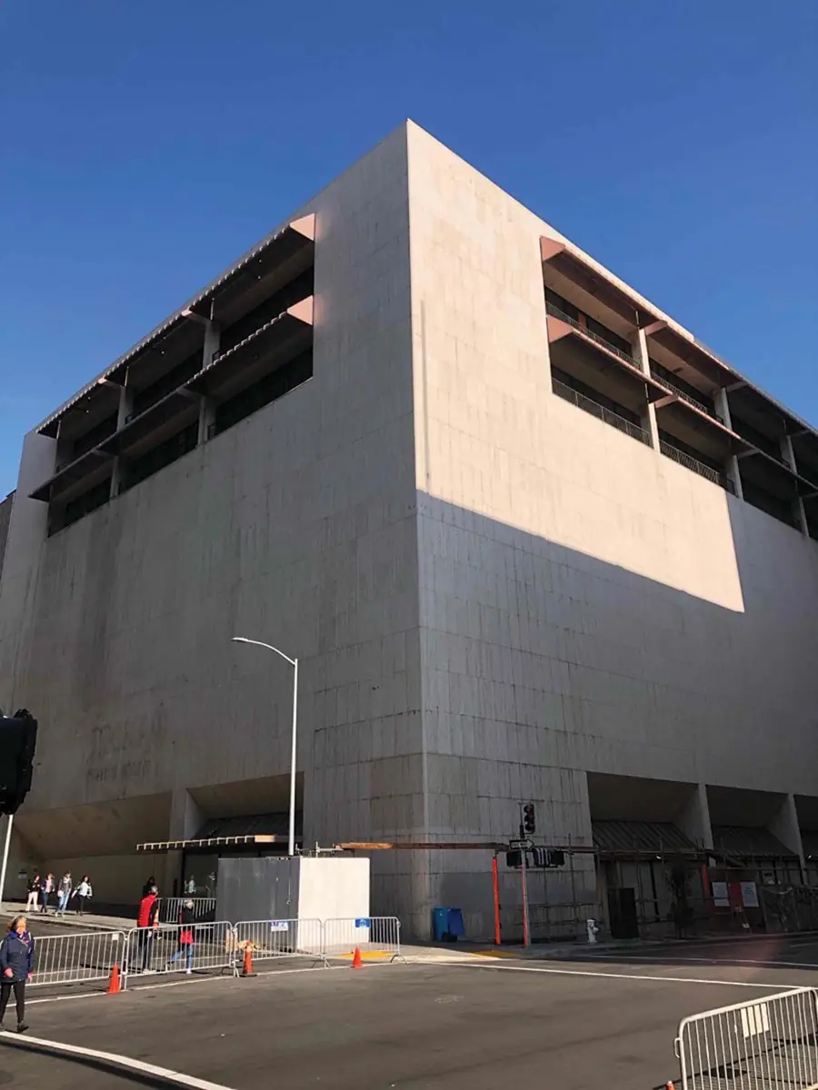
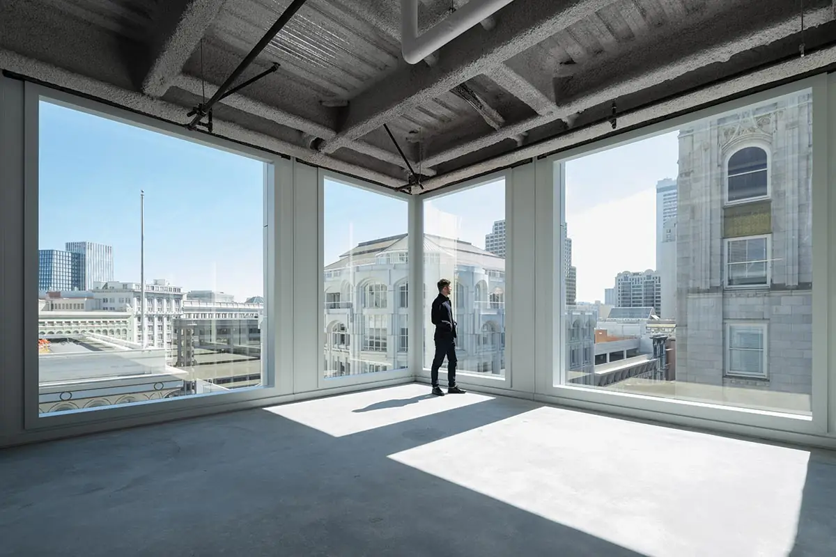
A nearly windowless San Francisco department store (above) has been transformed by Gensler into a transparent multiuse building (top of page). Photo courtesy of Plant Construction, click to enlarge.
San Francisco’s historic Union Square district has been troubled recently with a dramatic exodus of retailers, declining foot traffic, and rising crime, but the overhaul of 100 Stockton is one of a number of hopeful new signs for the area. Built in 1974 with blank exterior walls and a small central atrium for escalators, the former department store “really didn’t have an intentional relationship to the sidewalk, to the streetscape, to its context,” says Bob Perry, a design director in Gensler’s Bay Area practice. Tasked with transforming the seven-story single-tenant premises into a property that would be flexible and adaptable to multiple uses and tenants—what Perry calls “a sort of Swiss Army knife of leasing”—the designers aimed to provide “a base chassis” for the retail, office, and food-and-beverage market of the future.
Working from the inside out, the design team developed a scheme to provide upper-story retailers with the ground-floor presence and designated elevators they’d need to succeed. That scheme then informed the rhythm of a transparent new facade for the building. Prioritizing contextual fit (mandated by municipal design guidelines), the facade design takes as its parti the organization that many of 100 Stockton’s historic neighbors share—a base, a middle, and a tower, often topped with a crown element—and interprets these in a contemporary idiom. Most dramatically, the middle element, which in neighboring buildings typically comprises a band of facade articulation, is recessed to create a terrace along each of the corner building’s two street faces. Above the terrace, the building envelope lifts at an angle (supported on a new horizontal truss that transfers wind loads back into the main structure), making a dynamic gesture of opening toward the street corner. This occupiable component of the facade offers building users a fresh vantage point on the district, and at the same time signals the building’s new vitality to passersby.
1
2
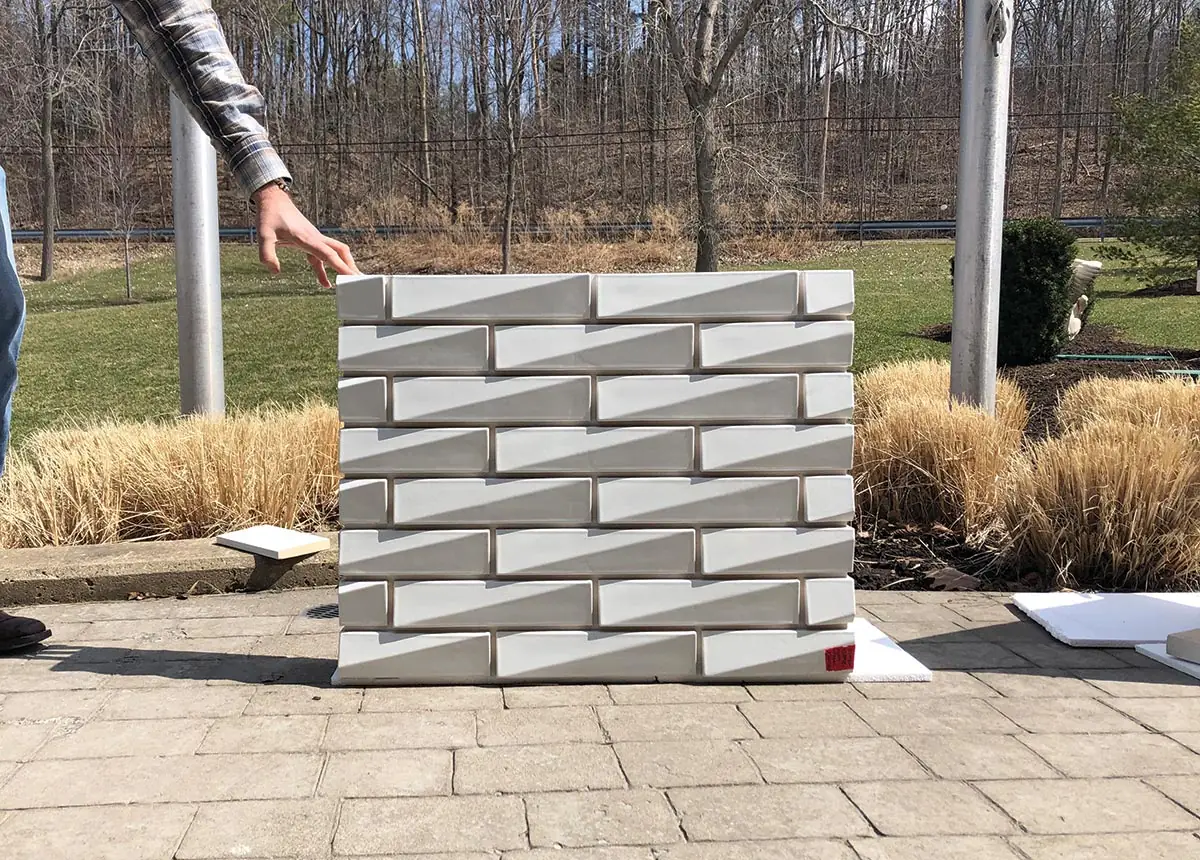
The base of 100 Stockton, in San Francisco, includes faceted terra-cotta tiles (1 & 2). Photos © Jason O’Rear (1), Gensler (2)
Click detail to enlarge
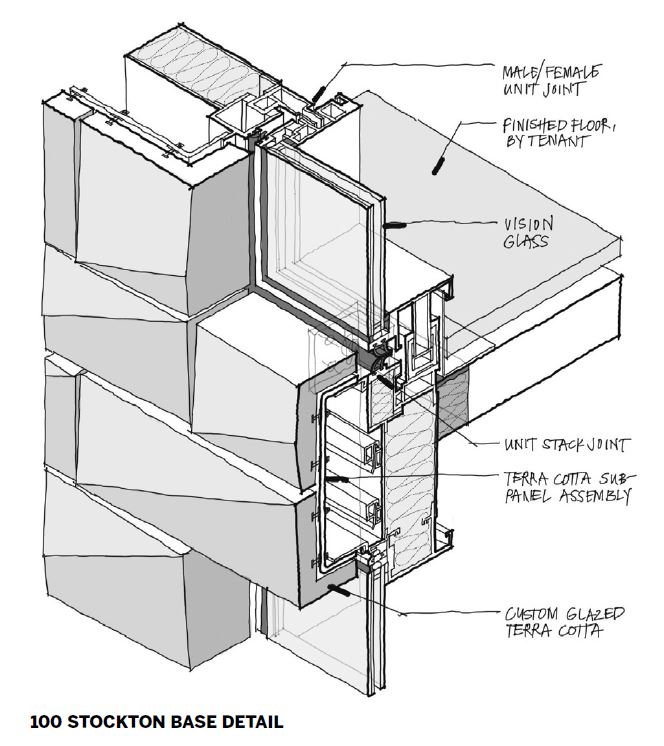
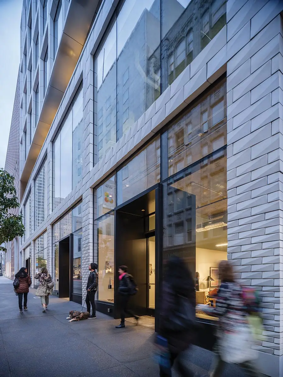
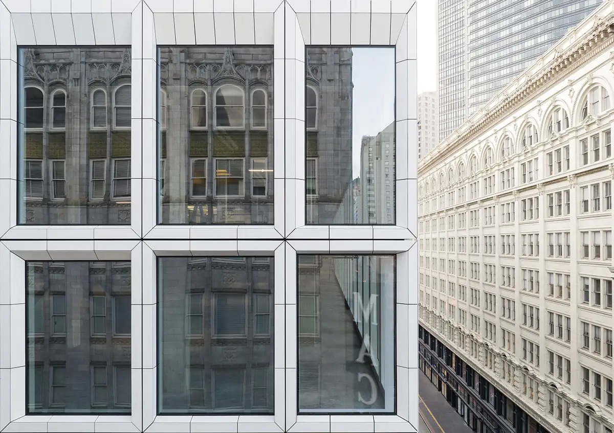
Just as a careful analysis of neighboring buildings informed the facade’s composition, a survey of the historic district’s materials—light colors, glazed terra-cotta, stone—informed its palette. The frame is clad in light gray terra-cotta tiles, but with some contemporary twists on the classic material. On the building’s base, a traditional running bond pattern has been vertically stretched and scaled so that tile units become larger as they go higher; for ease of fabrication and assembly, tiles have been slip-cast as large panels, their edges stepped so that joints feather into the pattern and mask the regular unitized construction joints behind the terra-cotta rainscreen. Taking advantage of the malleability of clay, tile faces have been faceted along the diagonal, with the result that they catch the city’s dynamic and atmospheric light. The upper section of the building is also clad in glazed terra-cotta, this time using extruded tiles, compound miter-cut and assembled into frames, which are then attached to a unitized curtain wall, and lifted into place. “It’s a really intelligent use of the process in an unconventional way to meet the needs of the design intent,” says Karen Brandt, a senior principal with Heintges Consulting Architects & Engineers, facade consultants on the project.
3
4
As part of a unitized curtain wall with generous glazing (3), the upper section of 100 Stockton is clad in extruded terra-cotta tiles with compound miter-cut frames (4). Photos © Jason O’Rear
Perry reports that the success of tenants so far—a restaurant that opened last year, occupying 10,000 newly constructed square feet on the rooftop, is fully booked weeks in advance; a workplace, meeting, and event host has taken two floors—is bringing foot traffic to the district, and there’s brisk interest from additional prospective tenants.
Looking for quick answers on architecture and design topics?
Try Ask RECORD, our new smart AI search tool.
Ask RECORD →
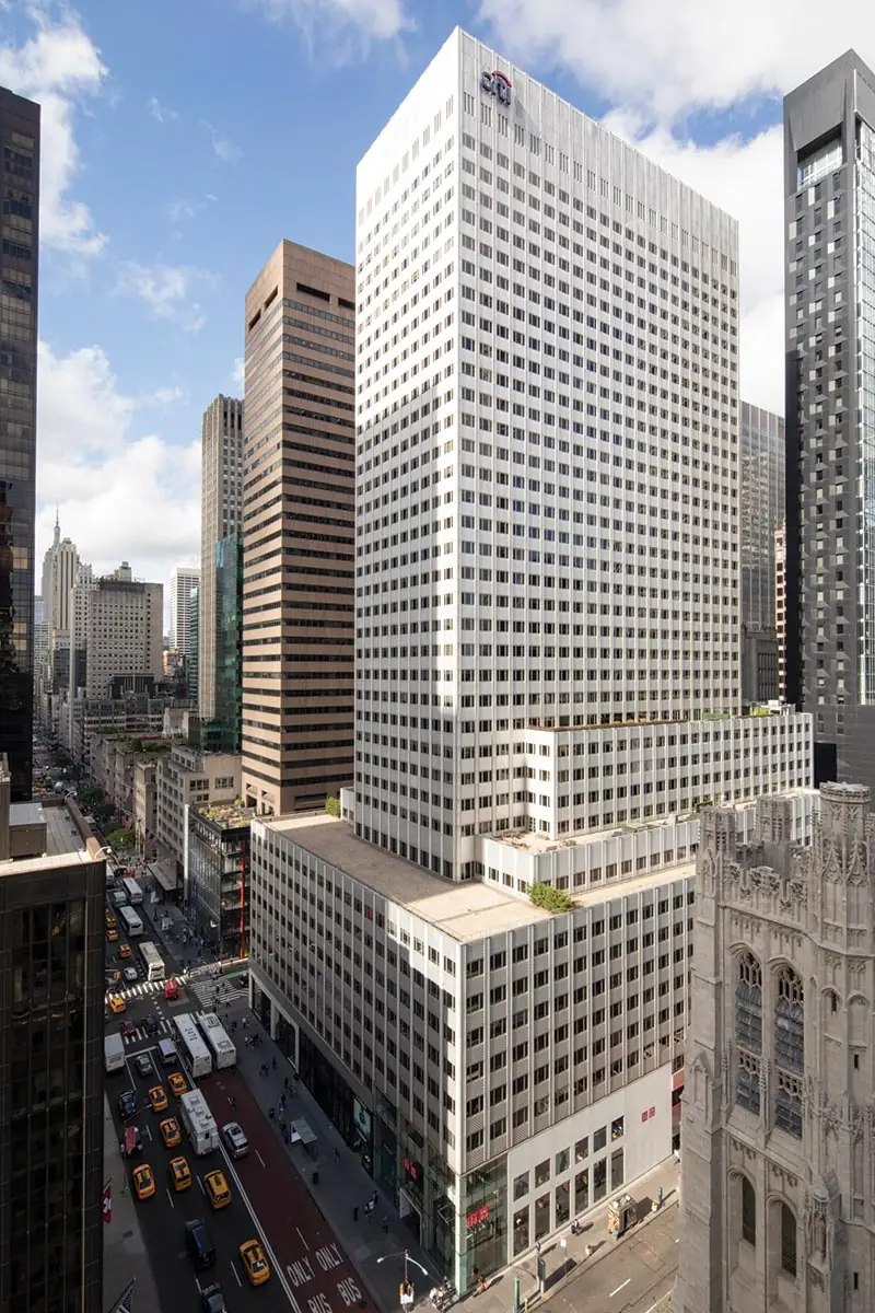
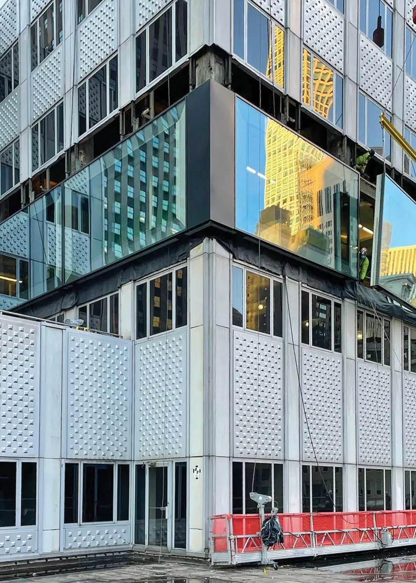
Pioneering when it was completed in 1957, 660 Fifth Avenue, in New York, was clad in uninsulated punched aluminum panels. Photo © Brookfield Properties
Where 100 Stockton had dwindled as a retail space, 660 Fifth Avenue, a 39-story tower-on-podium office building (numbered 666 before rebranding) in Midtown Manhattan, had declined as a workplace. With a column grid of less than 20 feet (compared to today’s spacing of 35 or even 45 feet for Class A premises) and 11-foot floor-to-floor heights (low by contemporary standards), the building struggled to attract tenants. Not helping was the building envelope—pioneering when it was built, in 1957—comprising unsealed and uninsulated modular panels of punched aluminum and single-pane glass. “It could have been a teardown and rebuild,” says Lauren Schmidt, a principal in the New York office of KPF. “But being able to understand the value that’s there—in terms of embodied carbon, a structure that’s still perfectly functional, and a floor-area ratio that wouldn’t be permitted under today’s zoning—and upgrade it to something that can compete with new construction is something we were all hoping to achieve.”
5
6
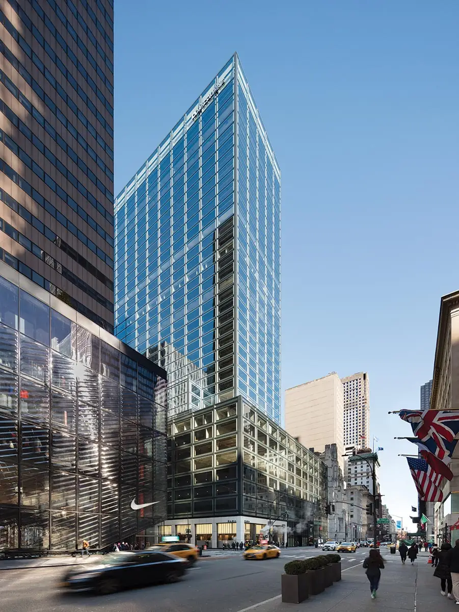
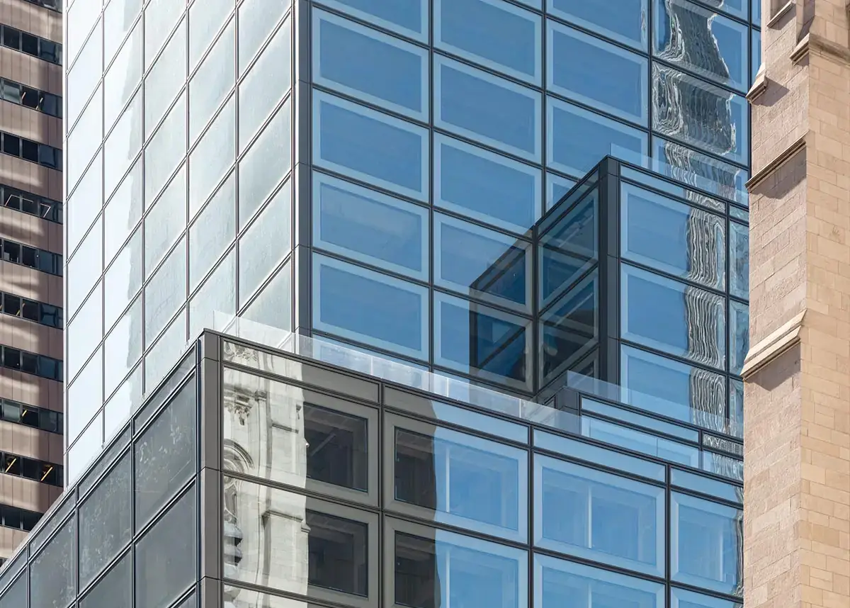
The revamp of 660 Fifth Avenue by KPF includes outsize 20-foot-long glazing panels (5 - 7). Photo © Raimund Koch, courtesy KPF (5 & 7), KPF (6)
7
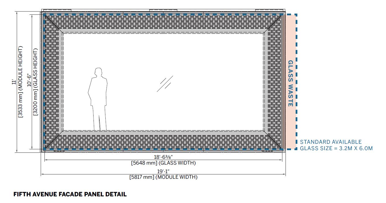
The main move in that achievement (completed in 2022) is a new, high-performance envelope distinguished by outsize glass panels that span the entire 20-foot column bay. Not just for the wow factor, these dramatic openings are a rational response to the constraints of the existing structure: on the one hand, 4-inch wire-mesh-reinforced floor slabs had no capacity to bear the weight of a new curtain wall, and, on the other hand, perimeter columns had capacity to spare. The design team reached the full-bay solution by increments, first modeling a 5-foot mullion interval (which would have required supplementary structure between columns) for a typical office module, then—asking, “how can we set ourselves apart from what’s out there?”—a 10-foot interval that aligned with structural columns and existing intermediate air-distribution columns (which would also have required additional structure), and, finally, removing those intermediate columns (and supplying air from above) to span the structural columns uninterrupted.
The approach turned out to be equally rational from a fabrication perspective. Working with Front as the facade consultant, the team learned that jumbo-lite glass comes off the production line with a height of 10½ feet, which would work perfectly for the floor-to-ceiling units, and a width of 19 feet, 1 inch, which meant that the fabricator would need to trim just once, for the 18½-foot width required. Making only one cut resulted in less handling and less glass waste, which also made the wider span more economical compared to a 5-foot module. And with 75 percent fewer mullions (which is where thermal bridging occurs), the double-glazed units and their frames achieve a U-value that’s equivalent to a 5-foot module with triple glazing. On top of that, the speed of the large panels’ installation (using a tower crane because there was no place on the building strong enough to set the panels down) took the entire team by surprise: by the time would-be spectators stopped by in late morning, day one’s work was already done.
Click detail to enlarge
As a marker of the success of the repositioning, even with its tighter-than-preferred column grid, the once largely empty building now competes with more typical Class-A space. “People you bring to the building immediately understand how it’s different—in a quality way,” Schmidt says. “It becomes something that attracts people who are excited about enjoying good space.”
Even when there’s no need either to change a building’s program or to compete for new tenants, sometimes it’s just time for an upgrade. That was the case for the Arthur J. Altmeyer Federal Building, the 10-story headquarters of the Social Security Administration (SSA), built in 1959 and unimproved since. With a poorly insulated envelope of cast concrete and high strip windows, and an interior layout of double-loaded corridors and perimeter offices that pushed support staff to the middle, access to daylight and views was limited throughout, and thermal comfort was conspicuous by its absence. “I recall moving from one side of the building to the other and having a temperature swing of about 20 degrees,” says Matthew Kreilich, design principal at Snow Kreilich, of his initial site visit. “Occupant experience was a major driver,” adds Kathryn Van Nelson, a senior associate at the firm.
8
In Maryland, Snow Kreilich replaced the thermally inefficient cast-concrete envelope (9) on a 1959 federal office building with a skin of glass and vertical aluminum panels (7). Photo © of Hall+Merrick/Kendall McCaugherty (8); Courtesy of SSA/GSA (9)
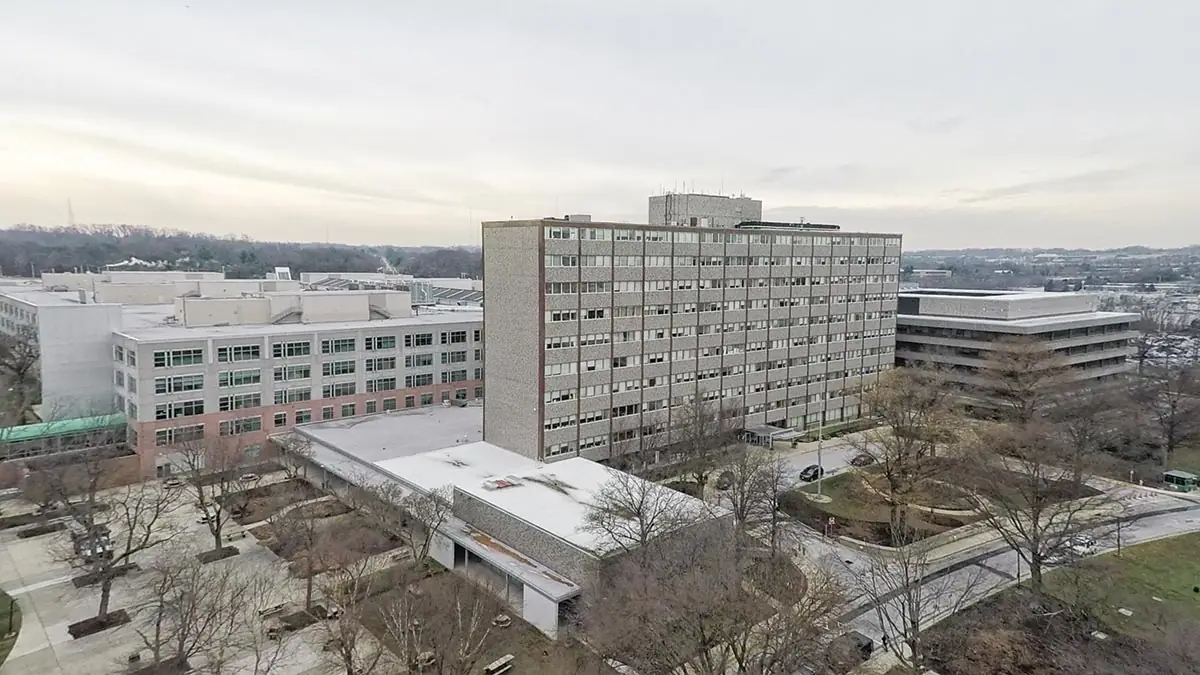
9
The renovation, completed as part of the U.S. General Services Administration’s Design Excellence Program, faced significant constraints. These included a tight budget, the vagaries of an existing structure (which offered up some severe variations in tolerances for the recladding to accommodate), security criteria, and limited ability to upgrade the environmental-control system, due to the building’s tie-in to an existing central plant that was housed in its basement.
On the plus side, the east–west orientation of the building’s length was ideal for designing the facade to maximize passive energy performance. Using a cost-effective unitized curtain wall that integrates floor-to-ceiling low-E insulated glass and anodized aluminum mullions and panels, the new facade varies in opacity from elevation to elevation in response to insolation (the amount of solar radiation reaching a surface). “It seems simple that you don’t just put the same facade around the entire building,” says Kreilich, “but, back in the Modernist era, that’s what we did. Either we weren’t conscious [of the energy implications], or maybe we were just stubborn.”
North elevations typically aren’t considered to need sun protection, but the new envelope’s meticulous design accounts for the fact that, between the spring and fall equinoxes, the sun rises north of east and sets north of west. Across the north facade, which is the building’s main face, vertical aluminum panels widen to increase opacity as they approach east and west, adding expression as well as protection to the facade composition. On the east and west facades, opacity increases even further to guard against low-angle solar gains. An applied ceramic frit, configured to account both for solar orientation and for free shading from nearby buildings and mature trees, further mitigates solar gains as well as glare.
Essential to the success of the modernization was a collaborative approach to design, says Van Nelson. Working closely with the project’s mechanical consultant, curtain wall fabricators, and Studio NYL as the facade consultant, the architect fine-tuned the envelope design to reconcile multiple variables. To ensure that the final product performed as designed, a building-enclosure commissioning professional, WDP & Associates, reviewed the installation, conducting third-party peer reviews throughout the design and fabrication process, on field tests, lab mock-ups, and whole-building air-leakage testing. “The enclosure is generally the most important part of the mechanical system,” says Studio NYL’s Babbington. “Given the tight constraints with this project, we had to make sure that was true.”
As a result of the modernization (which included reconfiguring the interior layout), one of the most unpopular buildings on the SSA campus has become the most loved, Kreilich reports. “To be able to move from space to space and not have a temperature swing, it’s a big deal,” he says. “And the impact of bringing in floor-to-ceiling glass, opening up the floor plates, rethinking the stairwells, and connecting to new, Olin-designed gardens is that now everyone wants to move into that building.”
The building enclosure is arguably architecture’s hardest-working system. Done well, it keeps out the weather, lets in daylight and views, links indoors and out, maintains thermal comfort, expresses function, tectonics, and identity, and contributes to the vitality of the public domain. As mid-20th-century buildings come up for renewal, projects like 100 Stockton, 660 Fifth, and the Altmeyer Building demonstrate what a new envelope can do to reinvent them as virtually new buildings.
Continuing Education

To earn one AIA learning unit (LU), including one hour of health, safety, and welfare (HSW) credit, read the article above and “The Renovation and Retrofit of 100 Stockton Street: Converting an introvert into an extrovert” (Rossi, David) Structure Magazine, vol. 29, no. 3, March 2022, pp. 51-53; then complete the quiz.
Upon passing the quiz, you will receive a certificate of completion, and your credit will be automatically reported to the AIA. Additional information regarding credit-reporting and continuing-education requirements can be found at continuingeducation.bnpmedia.com.
Learning Objectives
- Outline the characteristics that make many midcentury facades obsolete.
- Discuss recent construction and design-industry trends that are making building recladding a more attractive practice than it once was.
- Describe the recladding strategies for three commercial projects and explain how the new skins improved performance and marketability.
- Discuss how the three projects addressed budget, construction, and structural constraints.
AIA/CES Course #K2402A
Looking for a reprint of this article?
From high-res PDFs to custom plaques, order your copy today!


