Shaping the Show: Architectural interventions in museums and galleries
Whether the content of an exhibition is as ethereal as digital sound pieces or as concretely grounded as full-scale model houses, whether it draws on art, architecture, written documents, household objects, anthropological artifacts, or any other collection of information, the perennial conundrum is how to render the immaterial spatial—how to give the show’s concept impact and three-dimensional meaning for visitors moving through it. As artist Marcel Duchamp made abundantly clear when he signed a urinal for display in an art exhibition, the immediate surroundings can influence the perception, if not the experience, of the work presented. After all, even the convention of the pure white gallery with pedestals is hardly neutral, conveying, however tacitly, a particular narrative and character traits of the venue.
“In inviting someone to design an exhibition,” says Henry Urbach, curator of architecture at the San Francisco Museum of Modern Art (SFMOMA), “I’m not just bringing in a person to carry out my vision; it’s a way of making the interpretation and the conversation about a show’s form and content richer and more complex.” Independent curator Donald Albrecht, who has staged major shows in such places as the National Building Museum, in Washington, D.C., and the Museum of the City of New York, agrees. He welcomes an inspiring counterproposal to his ideas, a truly three-dimensional vision that may not have crossed his mind, he says, “rather than a matter of merely picking wall colors and typefaces.”
While the creators of gallery or museum installations have successfully included graphic and interior designers, an imaginative architect, attuned to the potential of both space and materials, is sometimes particularly well suited to take the curatorial content to a higher level. The history of architects shaping the spatial flow and surface play of temporary exhibitions is a long one, threading its course through the ephemeral interventions of Mies van der Rohe, in the 1920s and ’30s, and the work of Carlo Scarpa and Franco Albini in the mid-20th century, all the way to the present. Sometimes collaborating with graphic designers, many architects, from well-established celebrities to young upstarts, have had a hand in exhibition design—Frank Gehry, Hans Hollein, Venturi, Scott Brown, Zaha Hadid, Shigeru Ban, Coop Himmelb(l)au, Lewis.Tsurumaki.Lewis, and Escher GuneWardena among them.
“For us, exhibition design is exciting, a chance to test architecture through the temporary mode,” says Ada Tolla, a partner in the New York firm LOT/EK. “The work is quite immediate. Free from issues of long-term durability, you can tap into a whole palette of ephemeral materials.” Sometimes that testing ground actually anticipates significant aspects of an architect’s later, permanent work. (In conjunction with his design of the 1986 Alvar Aalto show in Tokyo early in his career, for example, Ban made the serendipitous yet seminal discovery of discarded cardboard tubes as a viable architectural material. He has gone on to feature them in many permanent structures, including his Paper House and Paper Church.)
Highly experimental installations, however, are not the goal of every venue. “Some museums want a consistent look and identity for all their shows (as at, say, the Museum of Modern Art or the Metropolitan Museum of Art—each has its own ‘house style,’ produced by a permanent staff),” says Albrecht. But then there are places, usually smaller institutions, that try to give each exhibition “its own identity and appearance. Of course,” he adds, “certain museums also acquire a ‘quasi-in-house look’ (whether by intent or not) through working with the same outside teams over and over again.”
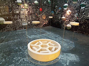
Often curators bring in architects when the spatial challenges are particularly complex. For the exhibition California College of the Arts at 100: Innovation by Design at SFMOMA (2007), Urbach curated a show celebrating the centennial of the California College of the Arts (CCA) with work by the school’s faculty, students, and alumni. But he was concerned that the vast range of objects—everything from posters and architectural models to cutlery, a water cooler, a chandelier, and a sandal—would come off as a “grab bag.” So he decided to “up the stakes,” as he puts it, and bring in an architect from CCA’s faculty.
Intuitively matching the commission with an architect, he chose Douglas Burnham of envelopeA+D, who unified the show’s 40 objects into a single plywood case on wheels. A sort of bent “ark,” as Burnham describes it, the vessel had a strong sculptural presence, with each of its “prows” projecting into a doorway, purposefully splitting circulation through the space.
The container, with variously sized windows at different levels, also recalled a giant, compartmentalized salesman’s suitcase, displaying merchandise. Here, each two- or three-dimensional object appeared behind its own window in an individual acrylic vitrine (recycled from previous exhibitions), lined in shiny, translucent Mylar. Through these sheer internal partitions, you could see myriad reflections and oblique, veiled views of neighboring objects—a kaleidoscopic effect that heightened the sense of multiplicity, while keeping the single object in the foreground in focus.
An equally tricky, but entirely different, set of spatial and perceptual issues has cropped up as sound and video pieces infiltrate museums and galleries. For Making Time (2001), Sound Channel (2001), and X_Static Process (2003–07), LOT/EK needed to define palpable space for such ethereal work. With Making Time (at the ICA in Palm Beach, Florida, and later, the Hammer Museum in Los Angeles), Tolla recalls, “The curator called us and said, ‘I’ve selected the work—it’s all about exploring time in video—but I’m not sure what to do with it next.’ ”
To organize and display this collection of video pieces, each with its own presentation requirements (including wall projection, monitors, and/or enclosure), the architects installed steel-pipe scaffolding that became the armature for the entire exhibition, defining separate spaces, holding monitors, and so on. Applying fluorescent gaffer’s tape in bands on the floor, LOT/EK created graphics that were visually compelling, but primarily instructional, guiding you through. To darken the space adequately but not excessively, the architects bathed it in blue light, which gave the fluorescent tape a magical Day-Glo quality, luminously evoking the moving image.
Also in 2001, LOT/EK designed Sound Channel for New York’s Whitney Museum. Tolla notes, “It was one of the first museum displays of sound pieces—and we definitely didn’t want to just put out headsets and chairs with a little list on the wall next to them.” Instead, the architects created an interactive, all-immersive corridor, also illuminated in blue. Here, “live walls,” activated by sensors, lit specific spots that corresponded to the 25 separate sound works, indicating which were in use. Highly visual and experiential, this solution connected the show’s content directly with the spatial configuration, as well as the actions of the visitors.
But the dialogue between a successful exhibition design and the existing space—as well as the work on display—can also be extremely subtle. And though the architect’s hand may sometimes seem all but invisible, it may have accomplished a great deal in giving a show’s content and concept both clarity and emphasis. For Extreme Textiles: Design for High Performance (2005) at New York City’s Cooper-Hewitt Museum, for example, curator Matilda McQuaid was concerned that the elaborate architectural ornamentation of the museum’s Carnegie mansion might compete visually with the textiles. “I wanted the work to be the first thing you saw when you walked in.” In response, architect Toshiko Mori designed an installation with central platforms and lighting that allowed the gallery edges to fade away into darkness, bringing into focus the grain and textures of the materials on display.
With textiles as the backdrop and visual filter, rather than the subject, Tod Williams Billie Tsien Architects (TWBTA) recently lined a series of galleries for a show of Louise Nevelson’s sculpture at the Jewish Museum in New York with a pale-gray spandex scrim that, in some places, wrapped the interior’s perimeter and, in others, stretched across the space. The idea for this 2007 installation, says Tsien, was to “calm the surroundings,” a former mansion with a warren of irregular interior spaces and complicated architectural articulations that threatened to distract from the intensity and power of Nevelson’s work (which, of course, draws on its own vocabulary of fragmented architectural ornamentation). The fabric liner over simple wood frames—a solution that respected tight budgetary and time constraints—not only receded quietly, though luminously, behind the mostly white or black sculptures, but also mediated viewer perception. At the show’s entrance, for example, visitors got a physically inaccessible but enticingly veiled view of a key sculpture, appearing through a gauzy “window” within an otherwise opaque fabric wall. With the placement of the largely seamless spandex establishing the circulation route, the path culminated with Mrs. N’s Palace, a towering 11-foot-tall piece. Over it, TWBTA removed an area of the existing 12-foot-high dropped ceiling and inserted a black scrim well above it. This move gave the large and visually complex work vertical breathing room, as well as a subtle interaction with its architectural container.
While some exhibition designs provide a modestly contrasting backdrop, others intentionally evoke the sensibility of the work on display. At its best, this approach veers away from literal pastiche in favor of abstract interpretation. Ban, at the 1986 Alvar Aalto show in Tokyo, for example, created an undulant ceiling of cardboard tubes that conveyed an affinity with the Finnish architect’s work without mimicking or upstaging it. In that spirit, TWBTA designed Quiet Light (1994–2001), a traveling installation of Isamu Noguchi’s Akari light sculptures. There, the architects inserted low, easily transportable fiberglass partitions that recalled the luminous translucency of Japanese paper screens, while subtly echoing Noguchi’s lanternlike forms.
Similarly, Chu + Gooding’s design of The Architecture of R.M. Schindler (2001), at the Los Angeles Museum of Contemporary Art, resonated with Schindler’s architectonics, but through a current-day industrial material: horizontal strata of exposed Homasote board.
Giving tactile immediacy to a museum exhibition about architecture is, of course, notoriously difficult, particularly if the display relies on documentary photographs of buildings: objects-once-removed. (Architectural shows tend to have greatest impact when they focus more on authentic drawings, as in the Schindler display, or on original, site-specific 1:1 installations by the architects.)
But whether an exhibition concentrates on architecture or not, its content may be almost purely informational, rather than a collection of individual works of art or otherwise rare and valuable objects. That was a big part of the challenge for Saucier + Perrotte in designing 1973: Sorry, Out of Gas, currently on view at The Canadian Center for Architecture (CCA) through April 20, 2008.
Surveying architectural and urbanistic responses to the 1973 oil crisis, implicitly in light of their relevance today, the show presents mostly documentation: photographs (with subject matter ranging from endless lines at gas pumps to energy-saving innovations in architecture and engineering), pamphlets, how-to manuals, news footage, books, clipped articles, and other artifacts. Though much of the material is compelling and, at times, amusing, it can’t claim the visual power of, say, a great work of art. So Saucier+Perrotte set out to give the journey through the exhibition strong spatial continuity and dynamism.
The architects created a black, prismatic object, more than 325 feet long, that snakes its way in and out of the show’s six galleries. Conceptually, “a deformed black cube—an elemental form,” as Saucier + Perrotte partner Gilles Saucier puts it, the twisting and turning object transforms itself. Starting out as a tunnel that engulfs viewers, the form becomes alternately horizontal and vertical, morphing into display shelves or vitrines, wrapping around existing partitions, and occasionally appearing to penetrate the white gallery walls, “as if plunging down into the CCA archive,” says the architect, “only to reemerge, displaying what has been found.” The black surface evokes a “dark and oily” quality. With constant shifts in scale, the form animates the space, addressing the overall exhibition, as well as the individual items on display. The design team further influenced the show’s character by suggesting, says Saucier, that certain images become huge wall murals and by proposing, for example, the coy grouping of vintage board games, all with oil-crisis themes, directly opposite monitors airing energy-related statements by political leaders.
Just as Saucier + Perrotte played a key role in modulating the impact of the work on display, so too did envelopeA+D, LOT/EK, Tod Williams Billie Tsien, and Chu+Gooding, each in different ways, with their respective exhibitions. Though, on occasion, an architect has performed simultaneously as the installation designer, curator, subject of the show, and creator of its content, clearly the role of exhibition designer alone can become remarkably varied and expansive.
Behind the scenes, however, exhibition design is, like most other architectural projects, strapped with pragmatic underpinnings. Regulating codes and restrictions are all at play—including fire and safety rules, minimum viewer distances from objects and other presentation requirements (sometimes stipulated by lending institutions and art insurers), lighting parameters, and the laws of gravity. Most of all, the raw content rarely fits readily into an existing venue, or the individual works with the other items on display. But just as the most inventive architecture transcends such seeming limitations, so, too, does stellar exhibition design.
Looking for a reprint of this article?
From high-res PDFs to custom plaques, order your copy today!


