The Story Behind a Drawing: Jesse Reiser on Aldo Rossi
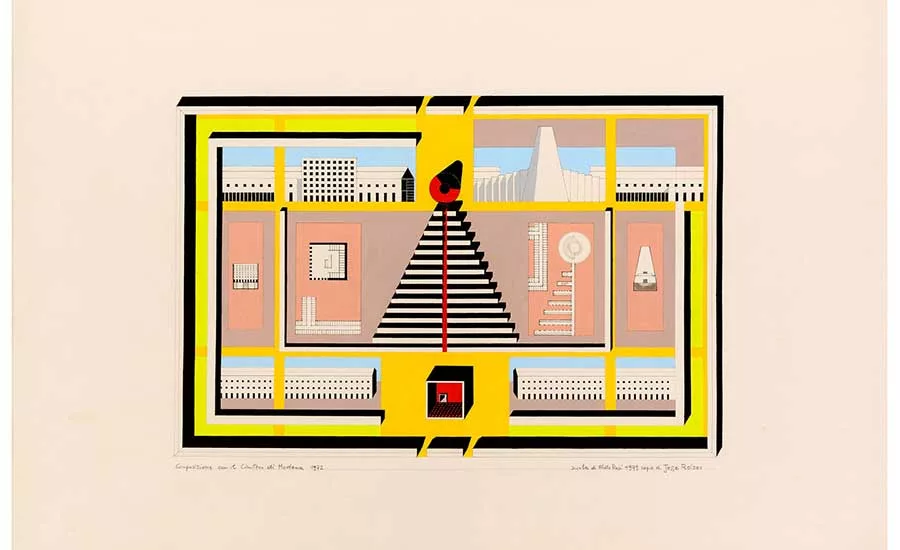
Jesse Reiser. Copy of composition with the Modena Cemetery by Aldo Rossi, Drawing Matter, Somerset, 1979.
Image © Eredi Aldo Rossi, courtesy Fondazione Aldo Rossi
On February 18th, RECORD published George Baird’s critique of the exhibition, Architecture Itself and Other Postmodern Myths, currently at the Canadian Centre of Architecture in Montreal. An attribution for an art work on display intrigued the editors. It was an attribution given to Jesse Reiser for “copy” of a design by Aldo Rossi’s Modena Cemetery. Reiser, whose firm Reiser + Umemoto is based in New York, has previously written of his involvement in this work in Drawing Matter. RECORD has excerpted part of his evocative essay telling of the days when the art of architectural drawing reigned supreme.
In the spring of 1979 John Hejduk invited Aldo Rossi to teach at Cooper Union. I’m not certain when he met Rossi, but Rossi was crucial, I would say, to John’s last major shift in his work. He saw something in Rossi’s analogical project that would allow him to transition from his purist work, which he was doing in relation to Bob Slutzky and others, to his metaphysical late projects. That is my intuition as to why he wanted Rossi. He invited him originally to teach the thesis group, but John was unhappy with their work so he shifted Rossi to the third-year studio, where I happened to be….
My third-year project was well received, so Rossi invited me and Frank Gerard, who was also in the class, to intern over the summer. It was a very small office–a total of only six or seven people–in a bourgeois apartment in Milan. It was actually not even an office, but more a case of desks set up in a domestic space–Via Maddalena Uno. He sat in the living room and worked on a big wooden board on trestles. He had a manual American typewriter, either an Underwood or a Remington–not an Olivetti, which was important to his position vis-a-vis design in Milan: it was a room with nothing to suggest high design.
He would spend the morning writing–he had a very structured day–and then look at projects in the afternoon, and then spend one day a week drawing on his own, maybe on the weekend. He would do two things: either hand drawing, or he would have film positives of drafted drawings that he would run through the blueprint machine and on which he would then use oil pastels and something called triolina–a solvent that would melt the pastel to produce more painterly effects and tints. He would apply this solvent with a rag, so he could either build up the surfaces manually and keep the strokes, or dissolve the strokes with the rag and produce washes. His drawings, then, fell into two rough categories: completely free-hand drawings and illuminated blueprints.
He wanted me because he liked the drawings I did at Cooper, and he had an idea: the drawings I would do that summer would be the beginning of a whole new portfolio. (I was supposed to keep doing them even when I got back to the States, and I never did. I only did a few.) It was not about the design of the Modena Cemetery. That had been done in 1972. This was about Rossi creating a school—in two senses: connecting to the old school’s painting, but also helping to move his architecture out of the Italian scene. It was part, I think, of his ambition to internationalize his project. It also connected to the Academical Village idea. It was part of the analogical architecture project, I think–or this is what I am projecting onto it.
Rossi gave me one of the large film positives of Modena that he used to run blueprints from. In retrospect, it’s actually really sad what I did: to transfer the drawing I put the film directly on the Arches paper, then used a pin to produce points, and then connected the points in pencil. There was nothing created by me. It was a transfer of an existing drawing and using the film was a practical expedient. The blueprints were large, but he wanted everything I did to be on rag paper so the film positive scaled it down to fit the dimensions of the paper. I basically ruined the film: I was taking pins and pushing them through it. It was a brutal and direct transfer of the drawing and it made the film useless to run future blueprints from. I still feel guilty about it. I was 21 years old and otherwise a very dutiful student. I was carefully looking at the other iterations of the Modena Cemetery and I was going to base the coloration on what I saw in those previous iterations, of which there were many. But he had something really specific in mind about what the colors would be.
He took me to the art supply store and he was pulling gouache tubes out and I was completely shocked because they didn’t match the other drawings of Modena in terms of coloration or palette. It was a strange combination of colors that I was convinced wouldn’t work. It was a mixture of beiges and tans in the background. This was a drawing for America, that is how I saw it. This was a way of being specific yet general enough to transcend site or place, sort of like the Hopper. Then he would have a strange abstraction of what he saw as local color, a weird mixture. He had what seemed to be combinations from Good Housekeeping or Ladies Home Journal, or like in the Birdcage restaurant at Lord and Taylor. I mean, you would see this palette in what were then called “restaurants for ladies,” which, ironically, were an attempt by American designers to be European in a tasteful way or what they thought was European.
Looking for quick answers on architecture and design topics?
Try Ask RECORD, our new smart AI search tool.
Ask RECORD →
He had his signature red, which was basically unchanged, then cadmium and then black. And then he pulled out – this was really the surprising part – these intense day-glo yellow-greens, which were more like the blacklight posters that my sister had up on her wall from the 60s. Or Peter Max, or Pop. So it was this incredible, counterintuitive palette that he wanted for the drawing. I was totally flabbergasted–but I went along, of course. I was convinced it wasn’t going to work, but it did. It worked really, really well.
I did the pencil transfer and then he would come by every day and we would do tests–fare una testa, fare una testa–so it was constant. Color location wasn’t completely preordained. We would do tests on samples to locate the colors and where they should be. All the colours were to be applied straight from the tube. No mixing. Totally flat graphics like silkscreen. It was important to him, obviously: it took a long time to do drawings, so he invested a lot of effort into every one, taking me to the store and also monitoring the progress. And when he finally signed it, it was: “School of Aldo Rossi, drawn by Jesse Reiser.”
It relates to classicism. It had a universality, or was attempting a kind of universality, which would be the counter to that of the modern movement. It was a cosmopolitan project different from that of modernism or the International Style of Philip Johnson and Henry-Russell Hitchcock–he was always ambivalent about both. But he had to somehow move his model from Italy and he did this with color. There is an ideality to the drawing, but then it’s localized in terms of color. Rossi, like one of his favorite writers, Borges, always went back to language, even in relation to color. Recalling Borges’ essay “The Argentine Writer and Tradition,” there is a famous argument which goes something like this: No camels are mentioned in the Koran, which is proof of its authenticity–the camel being too ubiquitous to mention. Only a regionalist, one who consciously resorts to local color, would commit that error. Rossi’s fictive palette swerves around that problem, being contradictory, everywhere and nowhere, authentically inauthentic—essentially American. He didn’t think I was an American because I was a Jewish New Yorker. The real Americans were Texans. I was too tragic and cosmopolitan in background. When he went to Texas: “These are real Americans.” The color choices were totally improbable – how could you get all those colors to work?—and there was no precedent for it in the office.
Looking for a reprint of this article?
From high-res PDFs to custom plaques, order your copy today!


