Close Up
Selldorf's Controversial Renovation of the Sainsbury Wing Reopens to the Public
London
Architects & Firms
Annabelle Selldorf will be happy if no one remembers the changes that her three-year renovation has brought to the Sainsbury Wing of London’s National Gallery. That will show that the museum has achieved its main goal—to bring millions of visitors through its new front door in an easy, intuitive way. It will also mean that she’s been able to recompose the building while retaining the essence of its design by Venturi Scott Brown Associates (VSBA), whose alteration caused consternation among enthusiasts.
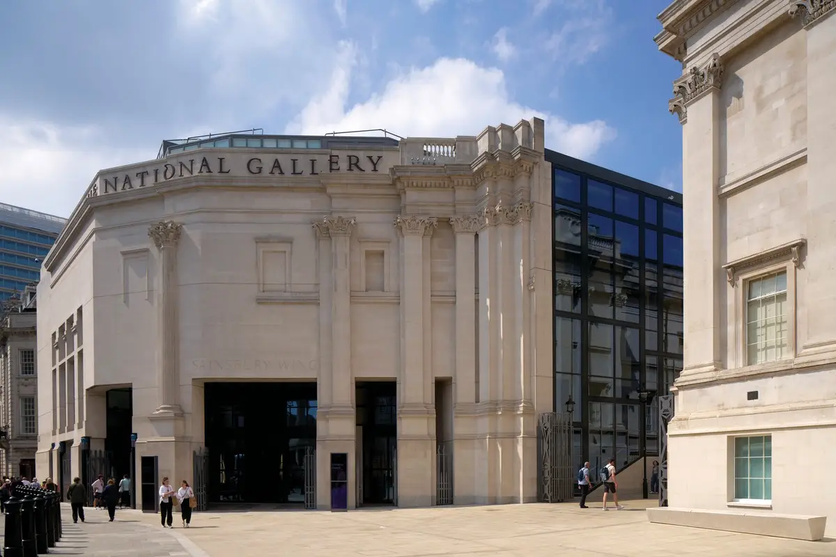
Controversy is nothing new on this site, adjoining the museum’s Neoclassical Wilkins Building on the northwest corner of Trafalgar Square. In 1984, a high-tech extension was abandoned after Prince Charles dubbed it a “monstrous carbuncle.” VSBA’s 1991 Postmodern addition mollified traditionalists. Comprising beautiful galleries above a foyer and restaurant on two lower floors, it is rich in witty historical references. Contemporary critics were excoriating, but in 2018 the wing was listed as protected heritage, as an exemplar of the style.
The overhaul of its lower floors is the principal component in a $113 million program marking the museum’s bicentenary, and was won in competition by New York–based Selldorf Architects with London-based heritage specialist Purcell. Much of the work responds to circumstances that have changed over the building’s short life. With growing focus on accessibility, the street-level wing had become the de facto main entrance. The need for tighter security had been dealt with in clumsy, ad-hoc fashion. Expectations of museums had also evolved—particularly following the success of Tate Modern, whose interior is treated as a natural extension of the public realm—but the National Gallery lacked informal gathering space.
That is first addressed as you approach on the bustling, pedestrianized North Terrace. At the end, where a narrow passage separates the two buildings, the architects have filled a Wilkins Building lightwell and leveled a raised patch of lawn to conjure a small forecourt lined with stone benches—a new square within Trafalgar Square. “People will soon forget what we’ve done,” says Selldorf, “because it feels as if it was always meant to be.”
This pocket piazza has outsize effects. It reveals continuity in the architecture of the buildings, so that they appear more clearly as a single entity. It also gives the Sainsbury Wing greater visibility, drawing attention to the entrance. And, by softening the distinction between public space and the museum, it should help to nudge uncertain visitors over the threshold.
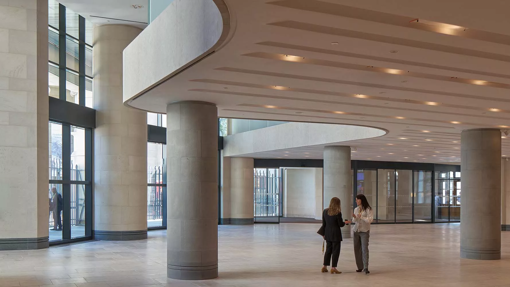
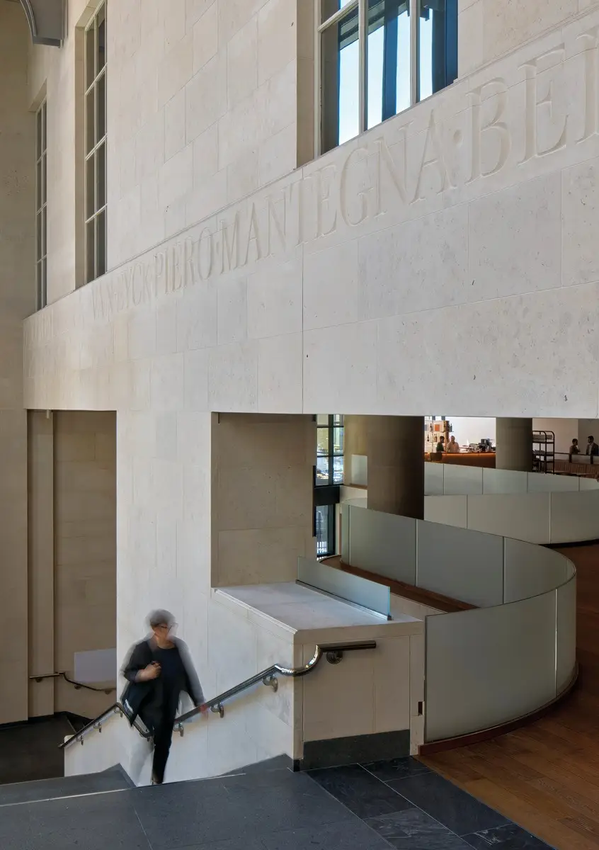
1
A small plaza has been inserted next to the wing’s glazed wall (1), offering the public views of the main staircase (2). Photos © National Gallery, London, by Edmund Sumner, click to enlarge.
2
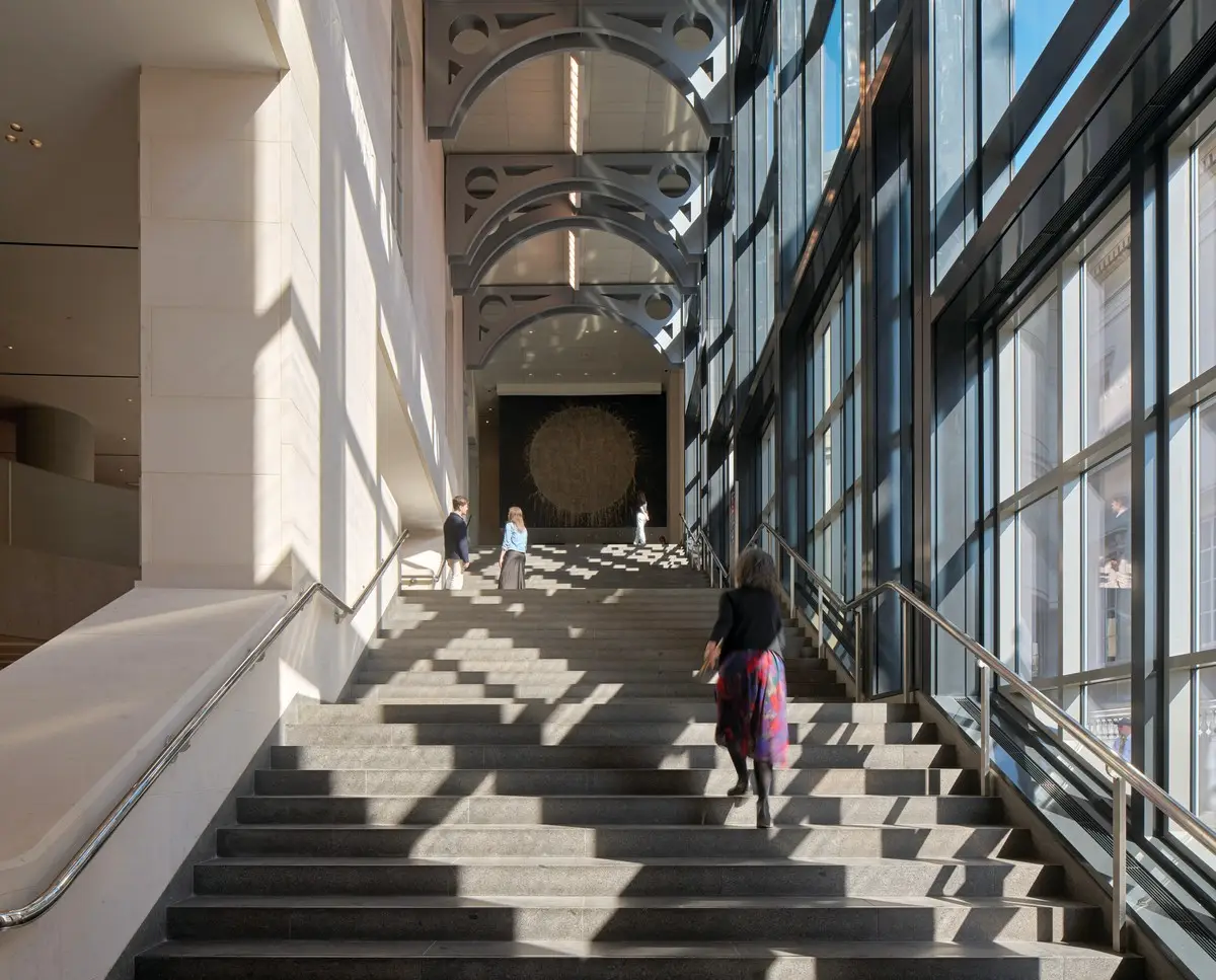
Other modest adjustments had the same ambition. In the recessed entrance loggia, heavy steel gates were lightened in color and rehung to fold fully out of the way. Originally, the building’s chunky curtain wall was fitted with dark glass, giving it the inscrutable look of a person in shades. Clear glazing now allows views of gallerygoers ascending VSBA’s grand staircase. “People like to see people,” says Purcell partner Alasdair Travers.
One section of the loggia is enclosed with glass to make an unobtrusive vestibule. Discreet metal detectors avoid the need for bag searches. Particular care was taken over this point of transition: the architects worked with Arup to model flows, and also polled the public on what makes a welcoming building. “It’s seeing a friendly face,” says Selldorf. “But architecture provides the place for that to appear.”
Looking for quick answers on architecture and design topics?
Try Ask RECORD, our new smart AI search tool.
Ask RECORD →
From here visitors enter the foyer—formerly a migrainous mess. Too many facilities were crammed into its tight footprint, compounding the suffocating effect of its design. A low ceiling, limited daylight, and a dense profusion of fat columns were intended to heighten visitors’ senses, through contrast with the lofty, toplit galleries and Renaissance paintings within them.
Recasting the Stygian crypt did not begin with a program, says Selldorf, but an “attitude”: visitors should have the greatest freedom to do as they please—to linger in comfort, or move through swiftly to reach a favorite Titian. That called for better visibility and lightness—in every sense—to relieve the oppressive confinement.
Her most significant intervention was to remove two sections of the second floor to make double-height spaces. On the west side, a bookshop that occupied half of the first floor has gone, along with meeting rooms above; the airy volume lit by two rows of windows is now a relaxed place to hang out. On the east side, the floor pulls away from the curtain wall in a graceful, serpentine curve. This void is flooded with sunlight, and more fully reveals the grand stair.
The second floor has been opened up to the level below and now reads as a mezzanine, with a sinuous glazed guardrail (above and top of page). Photos © National Gallery, London, by Edmund Sumner
In between, the second floor now reads as a mezzanine spanning from south to north. Under it, a 35-foot-wide digital screen shows works from the collection. It makes a natural meeting point, but museum director Gabriele Finaldi is most excited about curatorial possibilities: its 8K resolution gives unprecedented ability to explore every brushstroke.
Visitors enter below the low-slung mezzanine, so the journey still entails compression and release, albeit not as originally choreographed. Such changes were not taken lightly. The project began with intense study of VSBA’s work. The team visited various archives, read minutes of design meetings, and debated where historic value lies in modern buildings: in the fabric, like the stones of a medieval cathedral, or in the design language, or the overall experience? “It’s a bit of each,” says Purcell’s Travers, “and all those aspects are preserved, at different strengths in different areas.”
One example is the treatment of the numerous classical columns crowding the foyer. Selldorf thinned the forest to give better lines of sight to stairs descending to a refurbished lecture theater and a new subterranean passage to the Wilkins Building. Some super-size pillars were slimmed down, with materials reused; others have been shuffled to more convenient spots, and two false columns were removed. Demolition revealed a letter hidden within by the building’s patron, John Sainsbury, expressing misgivings about this feature: “a mistake of the architect.”
“Finding that was very touching,” says Selldorf, “because it happened after some strong criticism of our interventions.” While she welcomed discussion about the competing demands of preservation and utility, she took offense at suggestions that moves to relax the spaces, together with a low-key architectural language, would see richness erased by the banality of “art world good taste” or of an airport lounge.
In truth, criticism would be made of any alternative approach—whether emulation of VSBA’s work or additions in a new idiom that was equally full-flavored. And the palette that Selldorf evolved over the course of the project is subtle, but not simply neutral. Materials are used with specific purpose, while ceding attention to the wing’s heavy rustication, giant-scaled cove moldings and polychromatic Egyptian capitals.
Invisible repairs are made with the same French limestone. Portuguese stone flooring resembles London’s sidewalks, implying a connection. Where excisions reveal dissimilar columns on two floors, they have been reclad to illustrate structural continuity, in the gray Pietra Serena sandstone used by VSBA. Stone is honed, flamed, or polished to vary its texture. In place of the original coffered ceiling, scores of recessed light fixtures have handmade shades of Murano glass that add a hint of warmth.
On the mezzanine Selldorf has allowed a little more color, in a newly expansive space. Where the restaurant was once hidden away, there is now a direct connection from the main stair, and diners on the “bridge” have views over the scene below. A bookstore at the entrance is fitted out in dark fumed oak, while, at the far end, a copper-topped bar is clad in bright yellow volcanic Pyrolave. It has long been among Selldorf’s favorite products, but when her clients assumed a reference to Van Gogh’s Sunflowers—one of the museum’s star attractions—she happily accepted the “post-justification.”
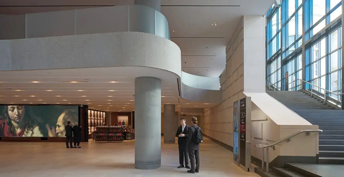
3
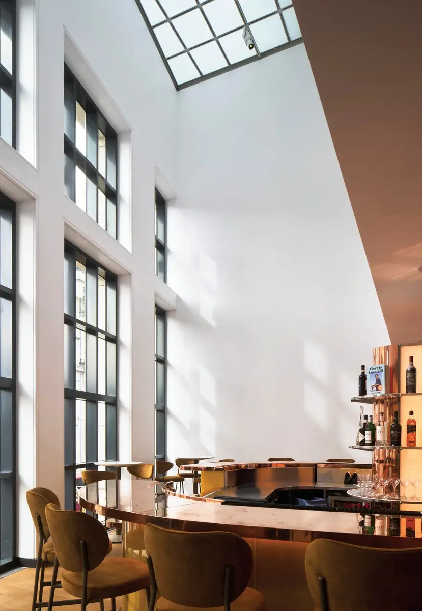
4
Visitors can use the main staircase (3) to access a doubleheight bar and restaurant (4). Photos © National Gallery, London, by Edmund Sumner
Visitors drawn to this once-remote corner will enjoy views that VSBA set up over Trafalgar Square and into the loggia. Throughout the wing, Selldorf’s new sight lines and enhanced transparency add to the sense that one is, as Finaldi puts it, “a spectator in the city.” Internally, too, the overlap of activities and juxtaposition of varied spaces introduces a new complexity to a building famed for it. Something is undoubtedly lost when any unique work of architecture is altered, but Selldorf’s changes amply compensate—whether or not today’s visitors notice.
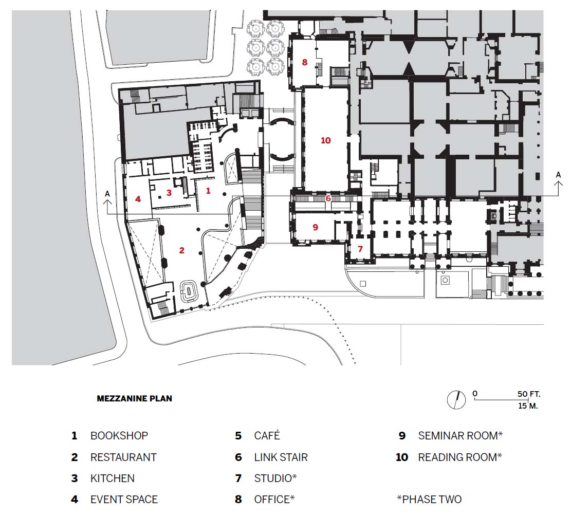
Click plan to enlarge
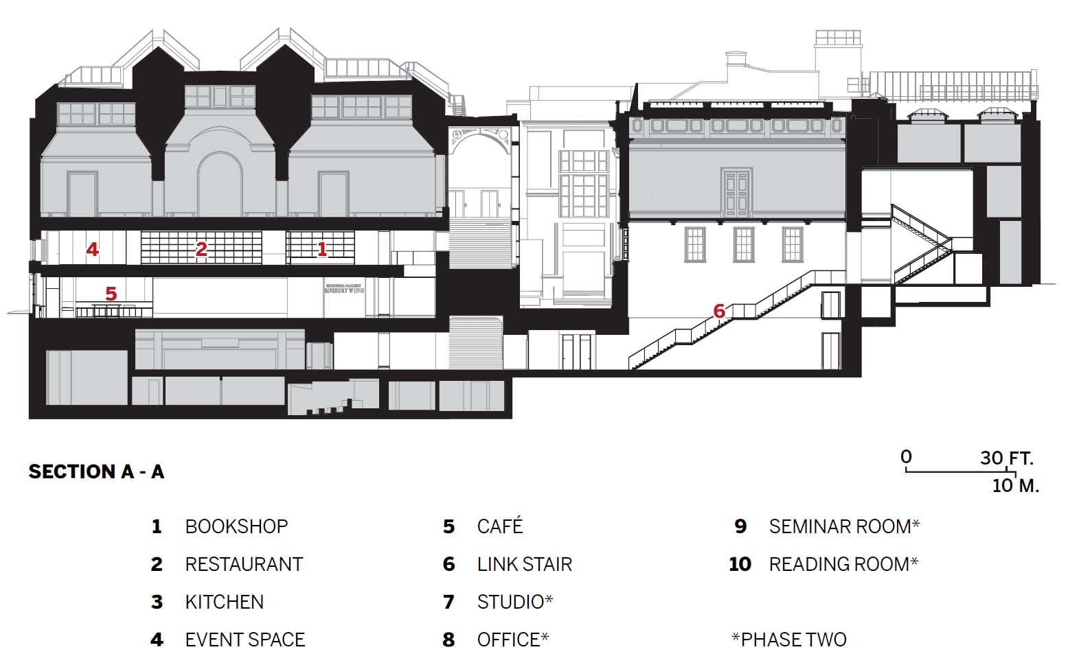
Click section to enlarge
Credits
Architect:
Selldorf Architects — Annabelle Selldorf, principal; Julie Hausch-Fen, partner in charge
Executive Architect: Purcell — Alasdair Travers, design partner; Kate Sanders, partner
Engineer:
Arup (various)
Consultants:
Purcell (heritage); Vogt Landscape (landscape); L’Observatoire International (lighting); Planning Lab (planning)
Construction Manager:
Gardiner & Theobald
Client:
National Gallery
Size:
48,440 square feet (phase I)
Cost:
$113.7 million
Completion Date:
May 2025
Sources
Curtain Wall:
Wicona
Glazing:
Guardian, Granada
Doors:
Stafford Bridge, Longden
Hardware:
John Planck, Dorma
Interior Finishes:
Ecophon, UK Acoustics (acoustical ceilings); Corian (solid surfacing)
Looking for a reprint of this article?
From high-res PDFs to custom plaques, order your copy today!


