Stephen Marshall Architects’ Tent-Like Maggie’s Northampton Brings Comfort to Cancer Patients
Architects & Firms
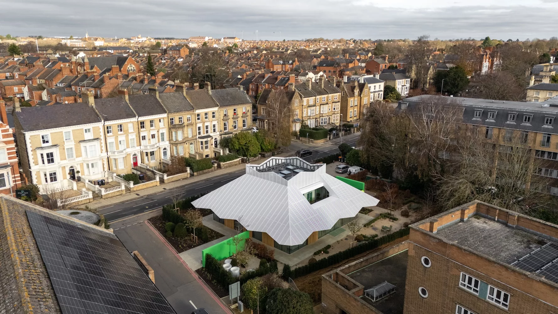
With a white pitched roof floating over walls of clear glass, the Maggie’s drop-in center for cancer patients at England’s Northampton General Hospital looks like a big party tent in a garden, awaiting guests at some happy event. The resemblance is intentional, says London-based architect Stephen Marshall, and while such associations might seem incongruous in a healthcare setting, they speak directly to the mission of the client.
Maggie’s is a charity founded in 1995 by the late architecture critic Charles Jencks and his wife, Maggie Keswick Jencks, to take forward ideas developed during her own cancer treatment. She envisaged uplifting places where patients could go for practical and emotional support, and to find relief from clinical, strip-lit oncology wards in well-designed, homey environments. Her succinct brief has now been interpreted in almost 30 diverse Maggie’s Centres designed by a roll-call of celebrated architects, from Norman Foster to Frank Gehry and Zaha Hadid.

Photo © Richard Bryant
Although they are dispersed across the United Kingdom and beyond, this family of small buildings provided one reference point for the Northampton project. “Everybody was aware that this center would be part of a group known for distinctive architecture,” says Marshall, “and that it had to have a strong character.” On visits to several earlier centers, the architects identified the attributes they found most effective: an intimate relationship between interiors and therapeutic gardens, and a determined focus on the fundamentals of the brief, avoiding the impulse to showboat by “solving problems that are not part of the problem.”

Photo © Richard Bryant
One challenge at Northampton was presented by the allocated site: a small parking lot on the edge of the hospital campus, surrounded by roads and a dense jumble of bulky buildings constructed largely from beige brick. “It’s like a bowl of porridge.” says Marshall. “I found the environment pretty demoralizing.”
Putting a compact, freestanding building in the middle of the plot allowed gardens to extend all around. A variety of activity rooms are on the first floor, along with a communal kitchen that is the physical and conceptual heart of all Maggie’s locations. Staff offices and private meeting rooms are above, within the pyramidal roof. Outwardly, it appears to be a single-story building, but with a usefully ambiguous scale: small enough to seem friendly but sufficiently substantial to hold its own among larger neighbors.
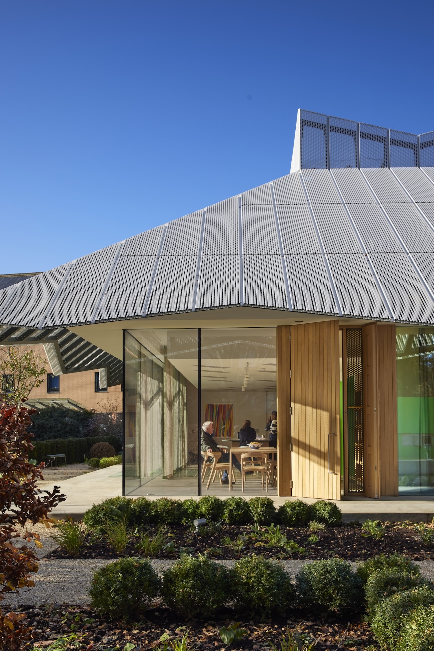
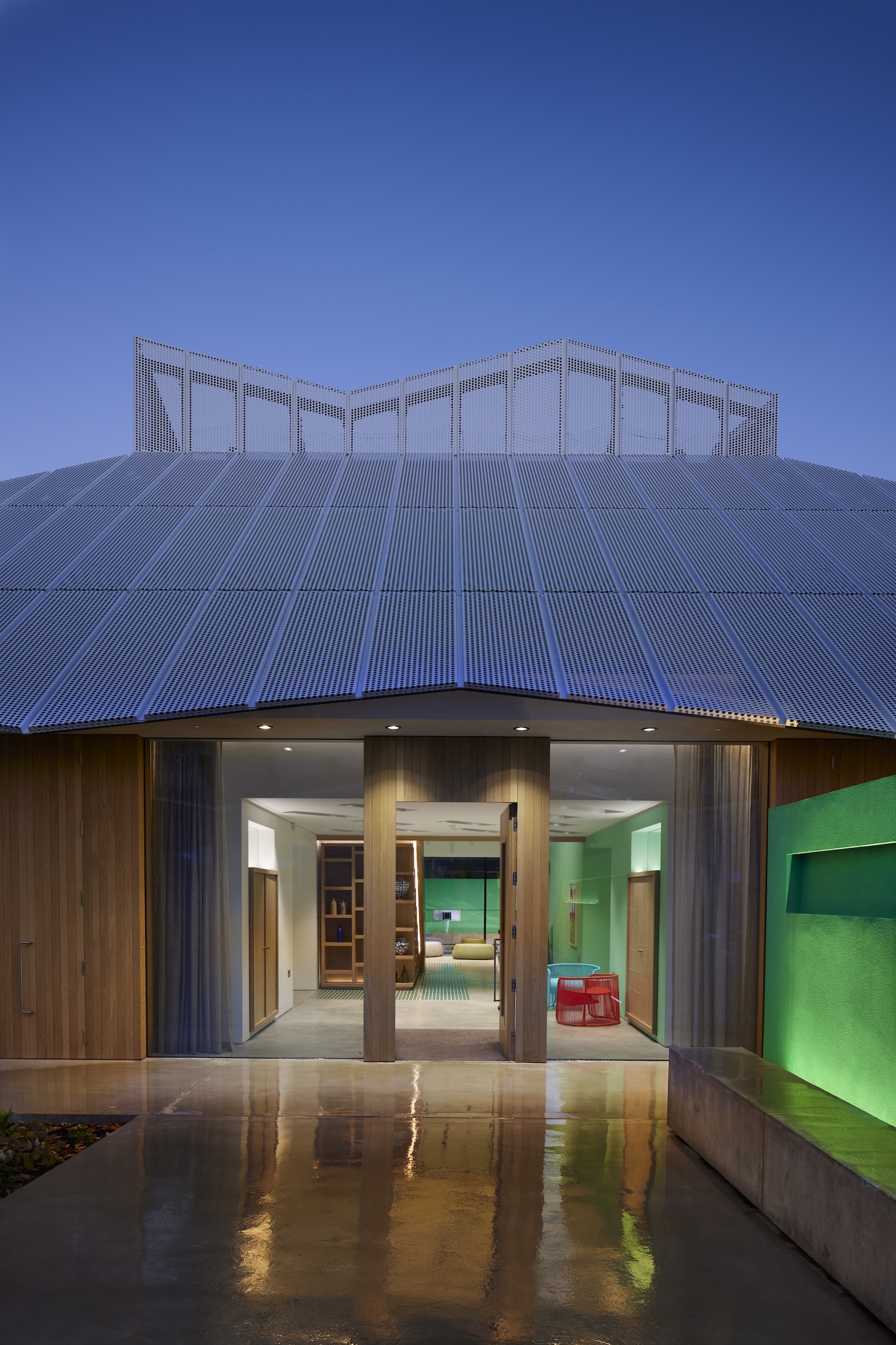
Marshall’s material palette also helps the center to stand out. Solid oak joinery and glass walls that meet in frameless corners draw on the refined details developed by the architects in residential and cultural projects. The eye-catching roof is clad in perforated aluminum panels whose taut lines and zig-zag eaves contribute to the tent-like appearance. Being conspicuous has an important practical purpose: Maggie’s Centres should be easy to recognize as they are often the place people head immediately after receiving a devastating diagnosis, in fear and confusion.

Photo © Richard Bryant
In plan, the building is a perfect square with 16-metre (52.5-feet) sides, which simplified the geometry and construction of the roof. With no structural elements in the encircling glass walls, the upper parts are cantilevered from four full-height steel columns encased within two thick spine walls that subdivide the interior. One of those green-painted partitions extends out through the garden to the entrance gate, guiding hesitant visitors onward. It is one of many elements—large and small—that show care for the comfort of people in distress.
Oak doors lead into a full-height, top-lit entrance hall, where a library is tucked beneath a broad oak staircase. Sliding doors open into comfortable rooms on either side; experience at other Maggie’s outposts shows that some visitors want to pause for a moment before introducing themselves to staff. The expansive kitchen is the main gathering space, but is positioned to one side to allow long, calming views through the building to the garden beyond.
Looking for quick answers on architecture and design topics?
Try Ask RECORD, our new smart AI search tool.
Ask RECORD →

Photo © Richard Bryant
The arrangement balances openness with enclosure, so that visitors can have company or seek quiet and privacy as they wish; one of the things the charity asks of its buildings is that they should help to restore a sense of agency to people whose lives have been turned upside down. From the foyer they might drift into the kitchen or choose one of the comfortable sitting rooms at the corners of the building, equipped with soft furniture and diaphanous flax curtains by interior designer Tricia Guild. Each has direct access to outdoor space. “The key thing was to have a natural flow,” says Marshall. “You just don’t do any dead-ends.”
A sense of generosity in the airy, interconnected rooms belies the economical planning. Marshall likens it to a typical house—a fitting reference point as all Maggie’s Centres are intended to have a “domestic” quality. “Residential developers don’t waste space, or indulge in gymnastics for its own sake,” he says. “We have a central atrium that lets a lot of light in, but apart from that big move it’s all pretty right-angled”.
Cost was an important consideration: Maggie’s Centres are paid for by local fundraising, which is more challenging in less affluent towns like Northampton. ($3.27 million of the undisclosed construction cost came from local businesswoman and racing driver Diana Russell, and the building is named in her memory). Considered but inexpensive details underscore the impression of quality in construction. Mosaic tiles are inset in the concrete floor to make colorful mats, and the voids between beams are exploited to make deep-set recesses in the plastered ceilings. In the kitchen, the island has a mirrored base to create the impression that it is floating. “Slightly corny tricks,” says Marshall, “but I think they work.”
The most powerful effect is achieved through the careful integration of architecture and landscape. Gardens designed by Arne Maynard take cues from the square geometry of the building, with planting, paths, and water features defining rectilinear “rooms” that perceptually extend the interior spaces. Here, the tight constraints of the plot were an advantage, suggests Marshall, allowing verdant views in all directions but with a reassuring sense of enclosure provided by a hedged boundary.
Photos © Richard Bryant
That combination of prospect and refuge is further enhanced by the architecture. The roof cantilevers beyond the glass walls by almost six feet on all sides, shading the interiors and sheltering a raised concrete pathway around the building, so that the gardens can be enjoyed in all weather. More protective vantage points are offered by two open-air terraces set into the roof.
These subtle inflections in space and mood skillfully capture what Maggie Keswick Jencks understood about coping with serious illness. One small building both provides comfort and a sense of safety, and—as equally important—a reminder of life’s pleasures and the hope that better times lie ahead.
Looking for a reprint of this article?
From high-res PDFs to custom plaques, order your copy today!


