Young & Ayata Revamp a Library’s Study Room at the Metropolitan Museum of Art
Architects & Firms
New York’s Metropolitan Museum of Art is in the midst of an ambitious building campaign. Recent and ongoing projects include the Michael C. Rockefeller Wing (2025), the Met Costume Institute’s Condé M. Nast Galleries, galleries for the Arts of Ancient West Asia, and the Tang Wing for Modern and Contemporary Art, a new addition designed by Frida Escobedo Studio that is currently under construction. While these high-profile undertakings have commanded much of the public’s attention, an intervention at the heart of the museum—a redesigned study room by the New York– and Los Angeles–based firm Young & Ayata—is an exemplar of maximizing impact at a smaller scale.
The 1,000-square-foot Nolen Study Room replaces the former periodical room (its volumes were digitized) within the Thomas J. Watson Library, the museum’s central research library. The facility opened in 1964 and replaced a 1910 McKim, Mead & White structure, which the museum had outgrown. It has all the hallmarks of many modernist buildings from that era: terrazzo-like concrete floors, white-paneled drop ceilings, and dark-stained beech shelving.
The commission forms part of a broader effort by the institution to expand its impact across varied communities. “It is important for us to be able to invite new audiences to the museum, and often the library is the first touchpoint for many students to come into the Met,” says Inka Drögemüller, the Met’s deputy director of audience engagement.

A new circulation desk greets visitors to the library. Photo by Hyla Skopitz, courtesy Metropolitan Museum of Art
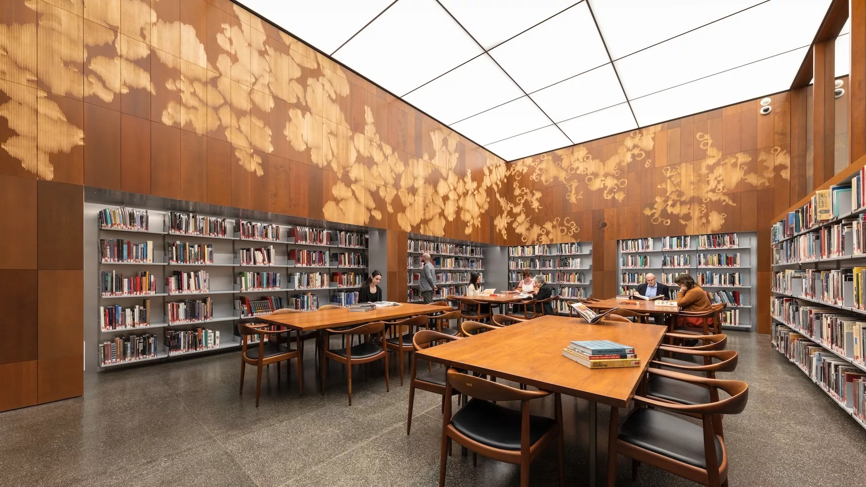
For the design team, and the client, it was key to maintain that stylistic and material continuity within the study room, albeit in updated form. The most conspicuous element of this approach is the space’s wall surfacing, which, in a clever move, is composed of recycled shelves sourced from the revamped space. The panels were deconstructed and sent to Situ Fabrication, in Brooklyn, where they were categorized and shuffled depending on length and thickness. The design team, inspired by a prior exhibition at the Grolier Club—a New York City-based society for bibliophiles—developed book marbling–like patterns that were then CNC-milled across the panels. “The idea is that everything that was in the room, stays in the room,” explains Michael Young, partner at 2016 Design Vanguard Young & Ayata.
The new bookshelves, built of aluminum and inset from the wall, are seven feet tall to match the existing datum line of wood-and-glass partition walls—they are stocked with 5,000 books selected to reflect the library’s collection. Overhead, a luminous, stretched-fabric membrane ceiling replaces the former drop ceiling; its gridded surface subtly echoes the layout of the original tiles. The new lighting system is reflected by the partition walls, and, in an illusory effect, extends through to the library. To help keep the entire look seamless, all of the room’s ventilation is handled by a one-and-half inch-thick linear diffuser tucked into the top of the west wall.

The luminous ceiling is reflected by the wood-and-glass partition. Photo by Hyla Skopitz, courtesy Metropolitan Museum of Art
A larger circulation desk and lockers now greet museumgoers to the library. There, I asked longtime Met librarian Jessica Ranne-Cardona, how the new space felt. “It is such an improvement…we’re beyond excited to welcome everyone back in person and to see their reactions to the space,” she said. “It is going to improve the user experience a million times over.”
Looking for quick answers on architecture and design topics?
Try Ask RECORD, our new smart AI search tool.
Ask RECORD →
Looking for a reprint of this article?
From high-res PDFs to custom plaques, order your copy today!


