Inside Out: A Tale of Two Embassies
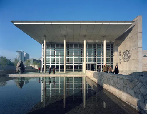
By placing the Beijing embassy behind a protective wall, SOM was able to use lots of glass on its buildings.
Photo courtesy Skidmore, Owings & Merrill
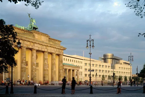
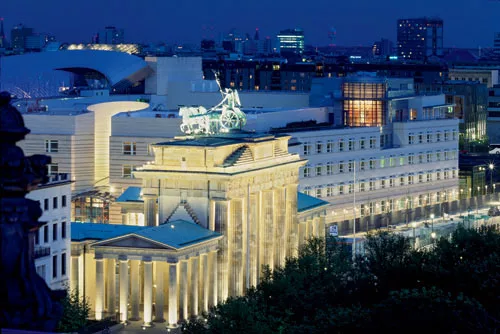
Standing next to the Brandenburg Gate (left in photo), Moore Ruble Yudell’s Berlin embassy engages the city with classic geometries.
Photo © Werner Huthmacher
A glass canopy announces the main entry facing the Pariser Platz, the public square that serves as the “salon” for cosmopolitan Berlin.
Photo © Tim Griffith
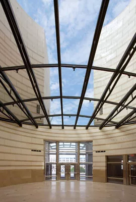
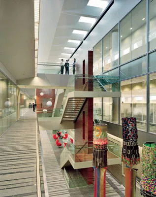
The canopy continues inside the building as a skylight above the entry rotunda.
Photo © Floran Bolk/Stadtwandel Verlag
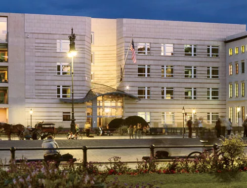
The building’s exterior needed to respond to U.S. security protocols and Berlin’s planning codes encouraging masonry street-wall facades.
Photo © Werner Huthmacher
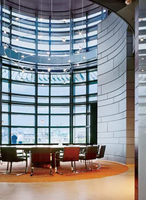
The ambassador’s conference room sits in a two-story lantern that acts as a hinge between intersecting volumes on the outside.
Photo © Werner Hutchmacher
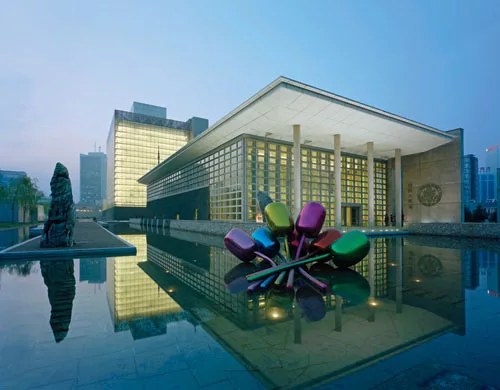
The eight-story chancery (office building) and the more horizontal consular building sit within a series of gardens, reflecting pools, and courtyards. Jeff Koons’s Tulips enlivens a pool.
Photo courtesy Skidmore, Owings & Merrill
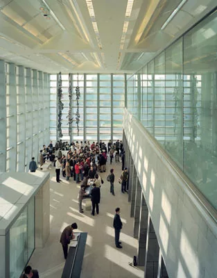
People applying for visas to go to the United States gather in the main hall of the consular building, enjoying views of the landscaped grounds and plenty of daylight.
Photo courtesy Skidmore, Owings & Merrill
Two State Department programs provided pieces by American artists for spaces inside the buildings, and outside as well.
Photo courtesy Skidmore, Owings & Merrill
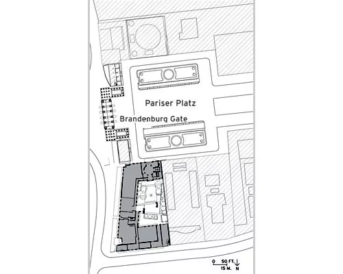
Image courtesy Skidmore, Owings & Merrill
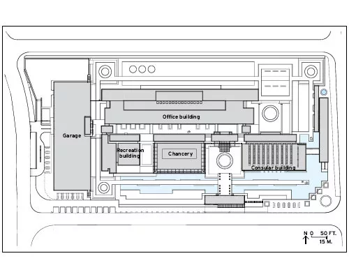
Image courtesy Skidmore, Owings & Merrill
BEIJING | Gardens and courtyards
The Berlin site is woven into a dense urban fabric, but the embassy in Beijing, designed by Craig Hartman of the San Francisco office of SOM, sits within a gated island of walled space several ring roads removed from the Forbidden City.
The firms competing for the commission happened to be in Beijing on 9/11. “I watched CNN in horror all night,” remembers Hartman. “In downtown Beijing the next morning, hundreds of bouquets with condolences were placed at the U.S. Embassy. It was very moving, and for me it reinforced the symbolic importance of our embassy and our project’s mission.”
The U.S. government’s early analysis of the 500,000-square-foot program suggested two towering and vaguely threatening megastructures on the 10-acre site. Hartman had another idea. “The fundamental design challenge was to represent American values in a sovereign country that has a cultural reality so different from ours,” he said. “But that’s the question that informed our search: how to build notions of a Western democracy within another political system.”
Counterintuitively, the architects found cues to democracy in Beijing itself. “We walked around Beijing and discovered these hidden urban spaces that were extensions of the social life of neighborhoods,” says Hartman. “People walked around the streets in their pajamas, playing cards, and as you entered courtyards off the streets, you stepped into increasingly private realms. A series of gardens and courtyards seemed like a natural way to deploy the embassy’s program. As in the Forbidden City, the embassy could enjoy the openness behind a perimeter that was walled and secure.”
Within a gated, guarded enclave, the architect enjoyed considerable design freedom, and the large site allowed him to build densely, without resorting to megastructures that could be interpreted as arrogant or imperialist. He hybridized the paradigm of courtyard neighborhoods with the notion of pavilions in the garden — that is, with visually porous buildings that shape gardens in a figure—ground relationship. He was interested in the single, stand-alone object as it weaves exterior and interior space into what he calls “a platform for social life.” Foregrounding voids between buildings and developing them as landscaped “solids,” Hartman turned the walled site into not only an asymmetrical architectural checkerboard, but also an urbanized enclave where the buildings shape the streets and courtyards of a cloistered but animated town. “We wanted to blur the edges between public and private,” says Hartman, “and foster all that accidental rubbing between people.” The idea was to create fabric rather than object.
The Beijing embassy has many constituencies, from Chinese nationals applying for visas to administrative staff, Marine guards, ambassadors, and visiting dignitaries. By breaking down the site into its main programmatic parts, Hartman cast it as a security gradient — ranging from an exterior that provides the greatest protection to a garden street that links a series of interior and exterior public spaces and serves as the project’s social heart. This long spine connects an auditorium, café, conference rooms, post office, and commissary to create a linear place where everyone at the embassy can mix. “The site plan is like an artichoke,” says Hartman. “You peel away the layers to get at the center.”
The architect massed small, medium, and large buildings and adjusted their degree of porosity to shape the qualities of outdoor spaces. The east-facing consular entrance, which leads to a portico structure, is the first encounter many Chinese will have with America; its open, human-scaled spaces are simple and welcoming. Dignitaries arriving at the entrance on the south side drive across a forecourt to a formal front door. In both cases, a bridge leads through a lotus garden.
The courtyards and landscaped streets may be the elements binding diverse structures into an ensemble, but SOM also threaded the buildings together with a conceit that echoes China’s biggest monument, the Great Wall. Using dark-gray, fractured granite, the firm erected a great stone “dragon” wall that meanders through the gardens, into and out of buildings, integral yet independent. Like an archaeological stratum, the stone recalls old Chinese structures. Other materials, including lotus and bamboo, respect the genus loci. Referencing Chinese tradition through materials, if not form, did not mean the architects were mining history for sentimentalism; rather, they were abstracting the culture of a place to a material essence that was not historicist.
The delicacy of the reference, though, would have been crushed by the sheer mass of the eight-story chancery building, and the longer, lower support office building behind it, but Hartman counteracts the impression of a bunker with a deft use of glass. On the chancery, a glass thermal barrier envelops the core concrete structure, with its pillbox security windows; the transparent veils the solid. Throughout the enclave, the architects played the nuances of glass off the opacity of stone, allowing views between the gardens and the interiors in a reciprocal inside-outside relationship. The gardens provided the reason to open the buildings and confirm the metaphor of democracy as transparency, and the glass added a lightness of architectural being.
It is tempting to compare the two embassies because they were completed within months of each other. But they began a decade and a paradigm apart. The Beijing embassy was conceived and built relatively quickly in a snapshot of design time, while the Berlin embassy developed as a time-lapse photograph capturing changes in Berlin and American political regimes, and the shift to a new architectural generation. Patience was part of the job description. MRY played defense. In Beijing, the perimeter wall allowed SOM to play offense.
DESIGNS THAT LOOK INWARD
Both projects show creative responses to the hard facts of protecting American diplomats abroad, challenging the architects to build fortresses in the city. In Beijing, Hartman hid and opened buildings behind a wall, whereas in Berlin, the building was the wall — a wall that was largely shaped by Department of State and Berlin dictates. Tellingly, in both projects, the architects turned their designs inward, developing interior spaces nested in more complex forms. American embassies can no longer be judged by their covers. They are not books. The best are Easter eggs.
In the simpler days before and after World War II, the architectural protocols for U.S. embassies yielded suave, pin-striped, diplomatic buildings — complete with sedate processional spaces, a hierarchy of parts, and idealistic symbolism. In a Classicized idiom before the war and then in a stately version of Modernism in the decades after, embassy designs expressed the virtue and virtues of the country itself. But the 1983 bombing of the U.S. Embassy in Beirut (which killed 60 people) and then the 9/11 attacks in New York City radically changed the government’s approach to embassies: Design became sited on a graph of frustration measuring cultural expectations against ever-steeper security constraints. The culture of formality in embassies has always bred just that, polite formalism, but the new restrictions put traditional architectural decorum at risk. Embassy designers faced the apparent, maybe even inherent, contradiction between the democratic ideal of an open building designed to portray a transparent society, and the security restrictions that virtually jail diplomats in safety.
With increasing difficulty, American architects have to locate their buildings at the intersection of what they want their designs to become and what they have to be. Just where the intersection lands on that graph pitting architectural desire against requirements depends not only on the instincts and the moves architects bring to the table, but how, like Houdini, they break free of the handcuffs. Host audiences, especially in countries wary of America, are watching. If you can see the world in a grain of sand, you can certainly judge America by its embassies.
The challenge facing architects becomes even greater with high-profile commissions, such as the recently finished embassies in Berlin and Beijing, where such projects are not architectural islands floating serenely above tides of criticism. In politically charged Berlin and culturally sensitive Beijing, the Santa Monica firm Moore Ruble Yudell (MRY) and the San Francisco office of SOM, respectively, negotiated a slalom of demands, each firm shaping a very different public image for its work set before highly judgmental courts of public opinion.
BERLIN | A Long Gestation
Now standing on its prewar site adjacent to the Brandenburg Gate, MRY’s American Embassy opened last fall to howling reviews. One embassy administrator, perfectly content working in a tranquil environment centered on a grassy courtyard, explained that German critics would have been kinder had the building opened during the Obama presidency.
Two-going-on-three sets of constraints prescribed the design. Soaked in history, some of it violent and Nazi, the site in City Center is susceptible to assault, because the city comes so close to it. Although the Tiergarten park bounds one side, the front faces Pariser Platz, the “salon” of cosmopolitan Berlin (leading toward the great architectural monuments of Prussian and German history, such as the Altes Museum and the Berlin State Opera). State Department design requirements mandated a bunkerlike wall on all sides, with a limit on the size of windows and a 100-foot setback opposite the Tiergarten. While wearing a dignified face, the building projects an attitude that is defensive — or, as many Germans wrote, paranoid.
The second set of constraints came from the design regulations set by Hans Stimmung, who was Berlin’s planning czar at the time. Stimmung believed that stone facades, not glass, defined the character and space of the European city, and his rules prejudiced all design in the City Center toward the typology of street-wall, courtyard buildings. Berlin’s masonry facades have long shaped streets as corridors of public space, so Stimmung reasoned that requiring these elements as a basic building block would help reconstruct the historic plan. While some Modernists have tried to abstract the rules, the city’s DNA is basically traditional. The American design mandate for securing embassies only confirmed the solidity of street-wall facades imposed by Berlin’s design statute.
The third restriction was the time warp — and aesthetic agony — of a 13-year-long project. MRY won the embassy design competition in 1995, when the embers of Postmodernism still glowed, particularly in the office of Stimmung, who hung on office walls tender Postmodernist sketches by Charles Moore (a founding partner of Moore Ruble Yudell). The winning MRY design drew inspiration from Neoclassical palaces of the German Enlightenment. Embedded within a composite of intersecting volumes, the main block featured a symmetrical, tripartite facade with the proportion and scale of aristocratic 18th-century buildings, and a rhythmic, symmetrical, ABBA fenestration pattern. Projecting character and story rather than abstraction, the golden-hued building embodied grace, symmetry, and lightness, as though Frederick the Great’s flute concerti might be heard wafting outside on warm evenings. Deferring to the Brandenburg Gate, the architects underplayed the facade, and sited a pavilion atop the structure to speak to the gate, object to object, symbol to symbol.
But that was then. In the 13 years since, as American security requirements hardened, and $50 million was subtracted from the original $180 million budget, architecture moved on, and so did MRY. Still, the firm remained faithful to its original commitment, even though the embassy finally opened after the firm was producing exuberant Modernism elsewhere. The architects held on to the pure geometries of Enlightenment forms, such as a lantern on the roof and a rotunda at the entrance. But the original clarity and poetry of the building weakened in the gestation, as architectural paradigms shifted. A building with a sweet historicist narrative edged toward abstraction, and took on weight, becoming stylistically ambiguous.
As built, the exteriors of the Berlin embassy come across as repressed, as though disciplinarian parents blunted the sensibilities of a sensitive child. Their role as a literate afterimage of a palace has ceded to the more conventional, less historicized typology of an office block, and their formerly wistful, vertically aristocratic character has become more businesslike, abstract, and horizontal.
Originally designed as an assemblage of intersecting volumes that responded to three different exposures, the building volumes stiffened in later iterations, and their warmth cooled. Because of a wider setback opposite the Tiergarten and the huge budget cuts, the embassy lost one full wing, the fourth side of the rectangular courtyard plan. Gone, too, was a “lodge” of small-scale “hospitality” rooms bordering the courtyard, with charming (and daring) vernacular shed roofs alluding to buildings in America’s national parks.
Still, facing the streets, the exteriors remained sensitively massed and masterfully scaled. The architects got the big moves right the first time, and kept them in later versions. The facades acquired subarchitectural elements such as sunscreens and trellises, which helped break down the scale of the architectural collage. “The scale was kept delicate, so the monumentality of the gate would have impact,” says John Ruble, the project architect. “Each piece had a clear role.”
The rules relax inside, where a different character emerges. A furling canopy graces the entrance on Pariser Platz and leads to a domed entry court that breaks open the four-story mass. On the Tiergarten side, the ambassador’s office penthouse shifts out of alignment with the office block below, revealing a double geometry inside, and a second nature. The building splits as parts align respectively with the different grids of the Brandenburg Gate and the adjacent streets.
Charles Moore advocated the principle of the Easter egg, whose shell hides an unexpected, elaborate interior. So, too, does the embassy: A design that tends to simplicity bordering on blandness outside verges on complexity inside. Even without the lodge, the architects make the most of the courtyard to humanize the building.
Responding to the budget cuts, MRY moved the lounge from the center of the court to the side, mingling it with the elevator core, main staircase, and corridor, so the public spaces border the landscaped court. The intersection becomes a social center. Partner Buzz Yudell notes his team “choreographed” the plan for serendipitous social encounters. The double geometry seen outside plays itself out more fully inside with one geometry moving back and forth with ease and discipline between the other, creating a complexity that eludes the simplified exterior. The architects orchestrate a rich palette of materials, including a variety of woods, and subtle colors to warm the already friendly organization. “ We often start with a fairly clear order, and inflect it in ways that deal with the specificity of the place,” says Yudell. “We played the formal against the informal.”
The interior, which few Berliners see, is where the architects exercised discretionary design, and by the time they reached the ambassador’s offices at the top, they outdid themselves in ingenuity, creating an extremely complex and literate suite of offices, richly detailed and beautifully executed in a spatial homage to the abstractions of the Bauhaus.
BEIJING | Gardens and Courtyards
The Berlin site is woven into a dense urban fabric, but the embassy in Beijing, designed by Craig Hartman of the San Francisco office of SOM, sits within a gated island of walled space several ring roads removed from the Forbidden City.
The firms competing for the commission happened to be in Beijing on 9/11. “I watched CNN in horror all night,” remembers Hartman. “In downtown Beijing the next morning, hundreds of bouquets with condolences were placed at the U.S. Embassy. It was very moving, and for me it reinforced the symbolic importance of our embassy and our project’s mission.”
The U.S. government’s early analysis of the 500,000-square-foot program suggested two towering and vaguely threatening megastructures on the 10-acre site. Hartman had another idea. “The fundamental design challenge was to represent American values in a sovereign country that has a cultural reality so different from ours,” he said. “But that’s the question that informed our search: how to build notions of a Western democracy within another political system.”
Counterintuitively, the architects found cues to democracy in Beijing itself. “We walked around Beijing and discovered these hidden urban spaces that were extensions of the social life of neighborhoods,” says Hartman. “People walked around the streets in their pajamas, playing cards, and as you entered courtyards off the streets, you stepped into increasingly private realms. A series of gardens and courtyards seemed like a natural way to deploy the embassy’s program. As in the Forbidden City, the embassy could enjoy the openness behind a perimeter that was walled and secure.”
Within a gated, guarded enclave, the architect enjoyed considerable design freedom, and the large site allowed him to build densely, without resorting to megastructures that could be interpreted as arrogant or imperialist. He hybridized the paradigm of courtyard neighborhoods with the notion of pavilions in the garden — that is, with visually porous buildings that shape gardens in a figure—ground relationship. He was interested in the single, stand-alone object as it weaves exterior and interior space into what he calls “a platform for social life.” Foregrounding voids between buildings and developing them as landscaped “solids,” Hartman turned the walled site into not only an asymmetrical architectural checkerboard, but also an urbanized enclave where the buildings shape the streets and courtyards of a cloistered but animated town. “We wanted to blur the edges between public and private,” says Hartman, “and foster all that accidental rubbing between people.” The idea was to create fabric rather than object.
The Beijing embassy has many constituencies, from Chinese nationals applying for visas to administrative staff, Marine guards, ambassadors, and visiting dignitaries. By breaking down the site into its main programmatic parts, Hartman cast it as a security gradient — ranging from an exterior that provides the greatest protection to a garden street that links a series of interior and exterior public spaces and serves as the project’s social heart. This long spine connects an auditorium, café, conference rooms, post office, and commissary to create a linear place where everyone at the embassy can mix. “The site plan is like an artichoke,” says Hartman. “You peel away the layers to get at the center.”
The architect massed small, medium, and large buildings and adjusted their degree of porosity to shape the qualities of outdoor spaces. The east-facing consular entrance, which leads to a portico structure, is the first encounter many Chinese will have with America; its open, human-scaled spaces are simple and welcoming. Dignitaries arriving at the entrance on the south side drive across a forecourt to a formal front door. In both cases, a bridge leads through a lotus garden.
The courtyards and landscaped streets may be the elements binding diverse structures into an ensemble, but SOM also threaded the buildings together with a conceit that echoes China’s biggest monument, the Great Wall. Using dark-gray, fractured granite, the firm erected a great stone “dragon” wall that meanders through the gardens, into and out of buildings, integral yet independent. Like an archaeological stratum, the stone recalls old Chinese structures. Other materials, including lotus and bamboo, respect the genus loci. Referencing Chinese tradition through materials, if not form, did not mean the architects were mining history for sentimentalism; rather, they were abstracting the culture of a place to a material essence that was not historicist.
The delicacy of the reference, though, would have been crushed by the sheer mass of the eight-story chancery building, and the longer, lower support office building behind it, but Hartman counteracts the impression of a bunker with a deft use of glass. On the chancery, a glass thermal barrier envelops the core concrete structure, with its pillbox security windows; the transparent veils the solid. Throughout the enclave, the architects played the nuances of glass off the opacity of stone, allowing views between the gardens and the interiors in a reciprocal inside-outside relationship. The gardens provided the reason to open the buildings and confirm the metaphor of democracy as transparency, and the glass added a lightness of architectural being.
It is tempting to compare the two embassies because they were completed within months of each other. But they began a decade and a paradigm apart. The Beijing embassy was conceived and built relatively quickly in a snapshot of design time, while the Berlin embassy developed as a time-lapse photograph capturing changes in Berlin and American political regimes, and the shift to a new architectural generation. Patience was part of the job description. MRY played defense. In Beijing, the perimeter wall allowed SOM to play offense.
DESIGNS THAT LOOK INWARD
Both projects show creative responses to the hard facts of protecting American diplomats abroad, challenging the architects to build fortresses in the city. In Beijing, Hartman hid and opened buildings behind a wall, whereas in Berlin, the building was the wall — a wall that was largely shaped by Department of State and Berlin dictates. Tellingly, in both projects, the architects turned their designs inward, developing interior spaces nested in more complex forms. American embassies can no longer be judged by their covers. They are not books. The best are Easter eggs.
Looking for a reprint of this article?
From high-res PDFs to custom plaques, order your copy today!