Ofita, Madrid
King & Miranda delivers layers of light and space to Ofita's Madrid outpost.
Architects & Firms
Madrid, Spain
When asked to sharpen the corporate image of the Spanish furniture manufacturer Ofita for visiting designers, architects, and specifiers, the Milan-based design and architecture firm King & Miranda transformed the company’s Madrid offices and showroom—located on two adjacent floors—into an integrated sales tool using a spare vocabulary of textural elements, colors, and lighting strategies.
To accomplish this, the design team—partners Perry King and Santiago Miranda, and project architect Caroline King—situated the principal meeting rooms on the showroom floor to increase traffic, and organized the work spaces on the floor above into a showplace for the client’s contract furniture lines. “People who before only came to the offices, now also have their meetings in the showroom,” Miranda explains. “It’s become a much more useful instrument.”
Minimalism and sustainability informed the design throughout. Existing walls and dropped ceilings were eliminated to maximize the sense of openness on each of the narrow, 6,500-square-foot floors. Structural columns, which march in two dense rows through the now open floors, are encased in vectorlike flanges. These dividers—made of gypsum board in the office space and luminous back-painted glass in the showroom—extend to organize circulation and establish zoned display and work areas. Dark gray carpeting and exposed ceilings painted a deep blue unite both floors and create a continuous neutral environment in which Ofita’s products and activities take center stage. Madrid’s powerful sunlight is tempered with permanently drawn screens on the windows, offering shadowy urban images through pinpoint perforations. However, while the two floors are similar in many ways, the designers employed distinct lighting solutions on each to create a dialogue of contrasts—both aesthetic and pragmatic.
The offices are illuminated with indirect light from an overhead fixture notable for its ability to prevent reflections, highlight depth and perspective, and define territorial boundaries. Named Smooth Light, the fixture is a King & Miranda design for the Italian manufacturer Luxit. Looking much like a lightweight glider, it has been meticulously distributed throughout the space, suspended below floating white panels (made of recycled wood chips) that diffuse light and absorb sound. A central fin, separating two T5 fluorescent tubes, aids in directing and further diffusing the light. According to Perry King, “Our idea was a [fixture], very light in appearance, with a presence that helps give a sense of location and perspective.” Task lights, he says are unnecessary with a fixture like this. On a more whimsical note, two cubelike “pods” for informal employee meetings are located on the extreme ends of the floor. Recessed halogen spots on their ceilings add sparkle, highlighting the bright orange walls and Konstantin Grcic’s playful Miura stools inside.
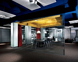
For the showroom, the designers selected their Star Strips fixture (also by Luxit) for the dramatic, directional glow its low-voltage halogen lamps give to the displays. Developed for the furniture galleries at the Castle Museum in Milan, this theatrical-like fixture, with its shallow, wide reflectors, was designed for maximum output and a wide beam, which keeps the light and heat from being too concentrated. “In the ducal chambers, the ceilings are something like 25 feet high, and the furniture was absolutely lost,” King recalls. “The pieces were very precious, and we couldn’t burn them with a lot of light, but we had to give them drama. And that’s exactly what we wanted here—to illuminate the products well, give them drama, and give the client a flexible tool to work with.”
As a focal point, two of the designers’ decorative incandescent pendants for Estiluz serve to soften and accent the showroom’s principal destinations: the stainless-steel Quepi Due at the reception desk and the stamped glass E-llum in the glass-walled meeting rooms at each end of the floor. In one of their most memorable innovations for the project, the design team used woolly curls of brass—intended for scrubbing kitchen pots—as an acoustical treatment for the ceilings of the meeting rooms in the showroom. “It cost very little but looks expensive,” says Miranda. Additionally, notes Perry King, “the brass is a waste material, so it’s ecologically sound.” The material also transforms the ceilings into a luminous field of burnished gold. This final detail offers a good summary of the King & Miranda strategy as a whole: using modest means to create a cohesive, memorable space that puts the client’s products in an entirely new light.
Looking for a reprint of this article?
From high-res PDFs to custom plaques, order your copy today!

