Newsmaker Interview: Ennead's Richard Olcott Designs a New Museum for Stanford University
In the spring of 2011, Stanford University reached out to Richard Olcott, partner at Ennead Architects, asking him to design a new museum space for a major collection of artwork recently acquired by the school. A gift from Harry “Hunk” and Mary Margaret “Moo” Anderson—as well as their daughter Mary Patricia “Putter” Anderson Pence—the 121 masterworks by 86 artists represent a comprehensive catalog of postwar American movements: Abstract Expressionism, Post-Minimalism, Bay-Area Figurative Art, and Light and Space, among them. Highlights include Jackson Pollock’s Lucifer (1947), Willem de Kooning’s Woman Standing—Pink (1954-55), Clyfford Still’s 1957-J No. 1 (1957), and Ellsworth Kelly’s Black Ripe (1955).
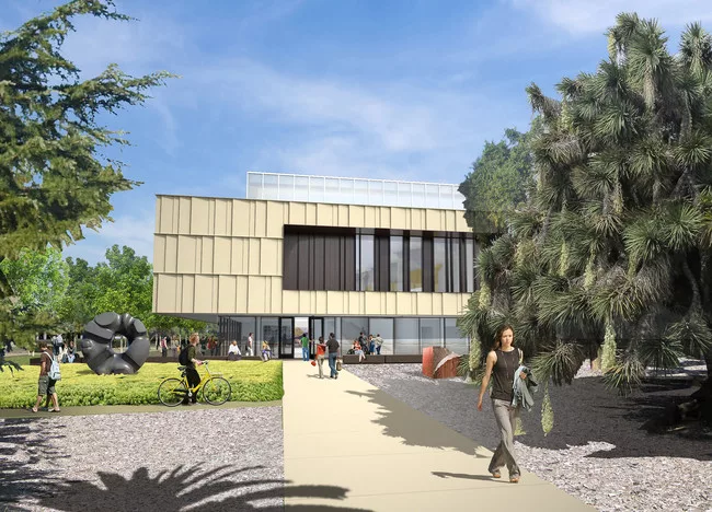
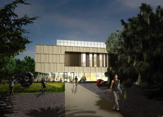
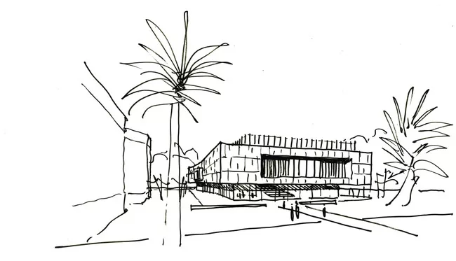
To house the trove of work, Olcott devised a lantern-like box floating above a glass-enclosed lobby and capped by a rectangular band clearstory windows. The ground floor of the two-story building houses all of the museum’s supplemental spaces—a foyer and restrooms, loading docks and storage, and a teaching space—while the second floor is comprised of galleries arrayed around a wide central stair. Exterior construction on the 33,000-square-foot structure has just been finished, and when it opens in September 2014, the building will complete a new arts district at the entrance to the campus.
While some of the work in the Anderson Collection is quite large, many have been housed for decades in the family’s Atherton, California, home, which Olcott has described as a “classic postwar California ‘ranch’ house: a series of interconnected spaces that embrace the site, extending out into the landscape under spreading shallow pitched roofs.” Within that setting, the art was lived with in a casual way. The architect recalls noticing on his first visit how candlesticks on the dining room buffet stood directly in front of the Pollock and how a Rothko squeezed in the entryway was hung just inches off the floor. With his design, Olcott aimed to capture the sense of both openness to the landscape and intimacy with the artworks he found in the Anderson’s home.
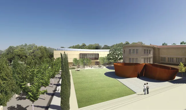
This is Olcott’s third turn designing for Stanford's arts district. In 1994, he and James Polshek (Ennead was then known as Polshek and Partners) undertook the renovation and expansion of the Cantor Center for the Visual Arts, which was built in 1891 and anchors the cluster of arts buildings. He and the firm also designed the Bing Concert Hall, which opened in January 2013. RECORD recently spoke with Olcott about the Anderson project and its campus context.
Eric Bryant: Where did the design process begin?
Richard Olcott: We started by going to the Andersons’ house to see the collection and then to Hunk’s two office buildings, where another 800 pieces were on view. So from those first visits, we knew that the work was of a certain scale and we determined that we wanted natural light that could echo those environments.
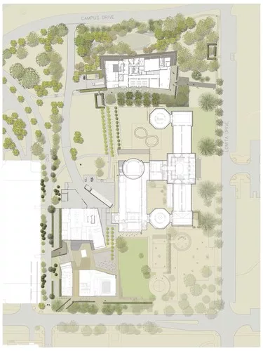
We also knew that the family had pledged 121 of those artworks, and the director of the Cantor, Connie Wolf, came up with 15,000 square feet as the amount of space necessary for that number of paintings. The site [adjacent to the 1891 building] also played an important role because we knew we didn’t want to make a tall building.
Given those constraints, we started by testing the waters with the team from Stanford—the Andersons, the university architect, the director of the Cantor, and a representative from the president’s office. We asked, "What kind of museums do you like?" and showed them a bunch of typologies of museum structures: a big box, a series or parallel halls with light at the ends, a group of pavilions, an amalgam of little rooms. All these were based on places like the Louisiana Museum outside Copenhagen [by Jørgen Bo and Wilhelm Wohlert] and David Chipperfield’s design for the Barbara Hepworth Museum in the U.K., as well as the Twombly building at the Menil Collection in Houston, the Fondation Beyeler in Basel, Switzerland, and the Nasher Sculpture Center in Dallas [all designed by Renzo Piano]. Eventually we coalesced around the current assortment of rooms around a central open stair.
EB: Did knowing the specific works in this collection provide the parameters for this design?
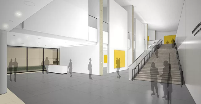
RO: We avoided thinking in terms of the placement of specific works in the collection. The curators wanted a variety of spaces, some large and some small. At one point, there was a conversation about putting the most important pieces in one place, so we have this large, daylit room at the top of the stairs, but that can change with different shows. There are also a couple spaces around the perimeter of that space with lower light levels, in case they want to do shows of sensitive works on paper.
Around the galleries there is no clear path; you can take it in any way you want. But we are hoping that after you come up the stair, you will see a big window to your left and you will be reconnected to the landscape.
EB: Light seems key to the design.
RO: Light comes in through windows on all four sides of the building, but the strip of clearstory windows, which also continues around all four sides, are the most important feature. They have two layers of glass, and in between, what is basically a system of venetian blinds that will be mechanically adjusted depending on what the sun is doing. We have one sensor on the roof, but we also have a number of sensors inside the gallery that automatically calibrates the daylight in 12 different zones.
To help spread the light, the ceiling above the clearstories is bowed—raised at the edges and very low in the center, at the top of the stairs. The idea is that it gradually compresses as you ascend the stairs, and then it pushes you out to the galleries. But the form also works to bounce light back down into the galleries. We are trying to get the ceiling and daylight to do the work, providing natural light throughout the building, while on a good day the electric lights will be off.
EB: How did you try to make this tie in with or stand out from the other structures in the arts district?
We went through some wilder things—we said “What if we made it out of CorTen steel?” and administrators said “No.” Some at the university were very concerned that if we were not going to blend in style, we should relate through colors and materials. So the style is distinct, but there are cues that connect to the other buildings, especially with the Cantor. We wanted to reinforce an axial relationship with the Cantor just to the south. (Click on the slide show to view a site plan.) The 1994 Cantor addition that we designed has a big drum on the north end. Its second floor is a sculpture terrace that looks toward the Anderson site at about the same elevation as the Anderson’s galleries. The main window at the left of the top of the stairs in the Anderson looks back toward the drum.
In terms of materials, the original Cantor is made from reinforced, cast-in-place concrete—it was one of the first reinforced concrete buildings in America. The tiles on the exterior of the second story of the Anderson, on the other hand, are precast, but the colors are a close match. The Anderson’s windows are trimmed in zinc, which is intended to pick up on the black window grills in the Cantor.
Ultimately, we had to stick close to the older building’s palette because the university had to go to the historic preservation office and explain how the new structure would relate to its landmarked neighbor. Once preservation officials saw the materials and colors, they bought in and signed off on the design.