Commentary
Anomalies in Architectural Criticism: Skyscrapers of the Early 20th Century
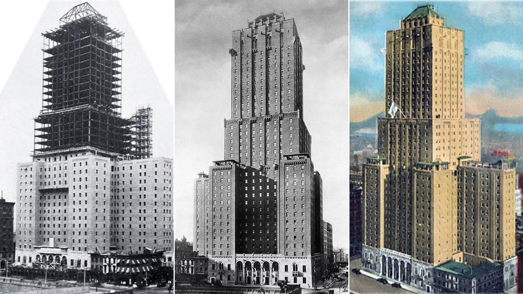
The Shelton Hotel: under construction in 1923 (left), completed in 1924 (center), and immortalized on a 1928 postcard (right). Photos: published in April 1924 issue of Architecture (left); © Sigurd Fischer, courtesy the Library of Congress (center)
It is always surprising to discover how the criticism of a particular building, such as a skyscraper, can change drastically over the years. For example, when the Chrysler Building opened in 1930, it was castigated by a number of critics for being too flashy. Today it ranks as one of the defining landmarks on the New York skyline. The Empire State Building, completed in 1931, was considered a formidable construction achievement. Yet its mooring mast, installed to assure it would be the tallest skyscraper in the world and rationalized as a landing port for dirigibles, made it a topic of ridicule among the critics. Now the Empire State Building has become the inarguable symbol of New York City, mooring mast and all. When the plans for Rockefeller Center were announced in 1931, a vigorous public outcry condemned the proposed scheme for its density, its height, and its bland, block-like buildings. The brouhaha led to revisions, but it was still criticized, until architects and laypeople began to admire it. Today this mecca for visitors embodies Manhattan’s essence of urbanity.
What is it that causes opinions to change? In analyzing critiques illustrating how some skyscrapers are vilified and then later venerated, or how some are embraced enthusiastically and later overlooked, we find a mix of reasons. For example, ideological beliefs to which both designers and critics may adhere, such as traditional or modern architectural principles, can shift over time. The aesthetic, functional, symbolic, and urbanistic criteria that determine these evaluations also are modified as the physical and cultural context is transformed. Then, too, the psychological effect of the “shock of the new,” where time is needed for the eye and the mind to adjust to the unfamiliar, can eventually dissipate along with initial judgments.
Early 20th-century architects searched for the appropriate expression of the skyscraper as a new building type. This “proud and soaring thing,” in Louis Sullivan’s words, should emphasize its verticality and honestly express the structural and technical elements (such as steel columns and lightweight cladding) behind its height. But, as buildings climbed higher and higher, the question became how to finish off the top. The spire seemed the way to go but also seemed so traditional, even recalling Gothic churches. As Modernism’s predilection for horizontality increased—reflective of curtain wall construction, with its glass bands of fenestration—the spire seemed anomalous and anachronistic. The flat roof made more sense.
These are only some of the factors affecting the evaluation of skyscrapers, and a small cluster of tall buildings from the 1920s to the 1940s illustrates the intensity of the debate over the ways the initial design approaches were first received and then evolved.
1. Shelton Hotel, New York
Arthur Loomis Harmon. 1924
Let’s begin with the least well-known but much adulated “skyscraper” of its time, the Shelton Hotel. Only 30 stories high, it was designed by Arthur Loomis Harmon before he joined up with R.H. Shreve and William Lamb on the Empire State Building. Architect and theorist Claude Bragdon, writing in RECORD (July 1925), applauded the way Harmon used “fenestration, outline, and mass” to express the different functions within the building, from guest rooms to social spaces such as the roof garden, gymnasium, and the squash court. Bragdon also approved the architect’s decision to batter the walls at the base and rely on entasis above, so “the walls have a slight slope inward, a thing felt by the eye rather than fathomed, conveying the same indefinable sense of satisfaction that one gets from a Doric column.”
In The New Republic in 1924, architect George Chappell commended the Shelton’s placement “on a tight urban site according to new zoning with setbacks required to avoid dark, airless streets.” However, the future problem could be detected. Lewis Mumford, writing in Commonweal in 1926, urged readers to go see “the best building in New York, one of the best buildings of the modern age” as soon as possible, since it was being eclipsed by surrounding construction: “The skyscraper as an architectural form is significant only when it is momentarily isolated from the chaos of other commercial buildings,” he wrote.
And soon the Shelton Hotel, surrounded by taller buildings, was forgotten, even though it still stands today, on Lexington Avenue between 48th and 49th streets, where it houses student apartments called FOUND Study Turtle Bay.
Looking for quick answers on architecture and design topics?
Try Ask RECORD, our new smart AI search tool.
Ask RECORD →
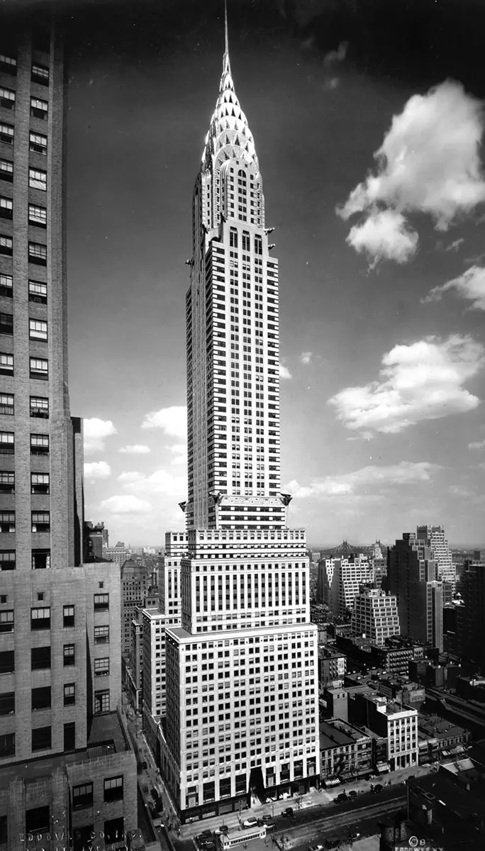
Photo © Eddowes Co., courtesy the Library of Congress, click to enlarge.
2. Chrysler Building, New York
William Van Alen. 1930
Next is a skyscraper that met a negative reaction from critics writing for a general audience. At the time when William Van Alen designed the Chrysler Building for the auto manufacturer Walter Chrysler, the 1,046-foot-high structure was the tallest in the world. The brick-clad steel-frame 77-story building’s setbacks and the decorative accoutrements of oversize gargoyle-like radiator caps, winged-helmet hood ornaments, and frieze of racing cars, plus a spire of chromium nickel steel singled it out. But, in The New Republic in 1931, Lewis Mumford was upset that the carmaker who “effected an aesthetic revolution in the design of the moderate-priced car” should commission this example of “romanticism without imagination.”
George S. Chappell (writing under the pseudonym “T-Square”) in The New Yorker in 1930 pronounced it “a stunt design,” adding, “it is merely advertising architecture.” Douglas Haskell (The Nation, 1930) approved of the way it “flashes and glitters in the sunlight,” but denigrated the top’s “Coney Island improvisation.”
The professional press, however, enthusiastically backed the Chrysler Building: an unsigned essay in The Architectural Forum (October 1930) raved that the Chrysler was “bizarre, fantastic, and exotic, it grasps and holds at least for a moment the attention of the passersby below, as well as the amazed interest of the countryside and the distant seafarers for miles around.” Architecture and Building, in August 1930, rhapsodized, “This building, dedicated to commerce and industry . . . has given New York City a most spectacular monument.”
Architect and writer Eugene Clute in another essay in The Architectural Forum (October 1930) maintained that the Chrysler Building “is an expression of the intense activity and vibrant life of our day.” Architect Kenneth Murchison, writing in The American Architect (September 1930), dubbed Van Alen “the Ziegfeld of his profession,” concluding that some may think the Chrysler is a “freak,” but “others consider it a great feat, a masterpiece, a tour de force.” Murchison prophesied: “Indubitably, the Chrysler Building will be surpassed in bulk and in height, but, as the others rise, watch out and see if they exhibit the originality, the sense of action, and the spirit of movement that William Van Alen has put into his design.”
While Van Alen’s professional colleagues admired his design work, he did not go on to create any more spectacular towers. In fact, he had to sue Chrysler for his fee. (Van Alen ultimately won, but the lawsuit damaged his reputation—it is said that potential clients were afraid to hire him.)
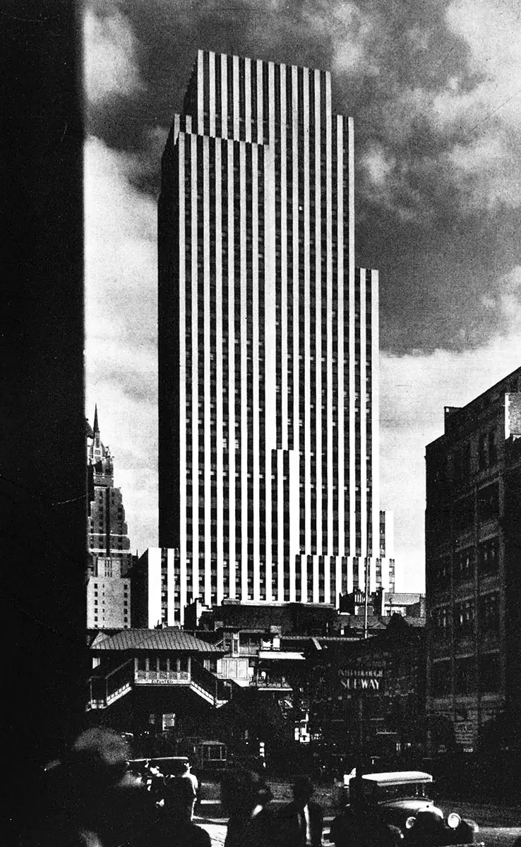
Photo © Nyholm & Lincoln
3. Daily News Building, New York
John M. Howells and Raymond Hood. 1930
When the Daily News Building, at 42nd Street and Second Avenue, opened, the arbiter of the International Style, Henry-Russell Hitchcock, called the 36-story high-rise by Howells and Hood “the most effective skyscraper in New York.” Today, it is almost forgotten as an early contribution to the design of tall buildings. In 1931, Lewis Mumford declared in The New Republic, “In many ways [the Daily News] is one of the best skyscrapers that has been erected since the Shelton.”
The catalogue for the influential show that Hitchcock organized with Philip Johnson, Modern Architecture: International Exhibition, at New York’s Museum of Modern Art in 1932, added about it: “The setbacks, each the width of a bay, are brilliantly handled in a way that does not produce a heavy pyramidal mass.”
Mumford attributed its design success to the straightforward emphasis on vertical lines, as did much of the other critical acclaim. The motif was heightened by the pattern of the brick cladding. In a Nation critique in 1930, Douglas Haskell described the masonry as a “bold negation,” for it was “almost nothing but a series of stripes, nothing but surface pattern.” The vertical lines of bricks created a “curious weightless” quality that “made the facade appear to float,” and “the lack of horizontals has almost destroyed perspective and depth, as in a forest of sticks.”
Kenneth Murchison, Hood’s colleague in designing the Beaux Arts Apartments on Manhattan’s East 44th Street, remarked sardonically about the Daily News, in The Architectural Forum: “‘Stripes’ is Mr. Hood’s middle name. He can’t get away from them.”
Nevertheless, Talbot Hamlin, in The New International Yearbook (1930), found “the superb straightforwardness of the simple upper part” was belied by the “weak and sentimental” entrance. Hamlin objected that the domed, black-glass-clad lobby, with a large revolving globe of the world at its center, was “over-ornamental” and “like a circus sideshow.”
Today, the newspaper has moved elsewhere, and, while the lobby was landmarked in 1998, few wander inside.
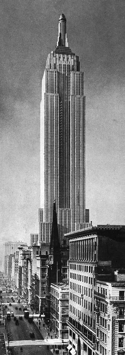
Photo © Yosei Amemya
4. Empire State Building, New York
Shreve Lamb & Harmon. 1931
The critical reaction to the Empire State Building, at 1,250 feet the world’s tallest skyscraper for four decades, was mild in comparison with that of the Chrysler Building.
Vertical motifs ruled. George S. Chappell (as “T-Square”) explained in The New Yorker in early 1931 that the way the detailing emphasized the verticality “is the very breath of the design.” And literary critic Edmund Wilson proclaimed in The New Republic, shortly after the skyscraper was dedicated in 1931, “There is no question that the Empire State Building is New York’s handsomest skyscraper.” He added, “This towering plinth, though it is the tallest in the city, has almost always an effect of lightness,” much owing to the “long lines of nickel facing.”
While Chappell had objected to the mooring mast, planned to accommodate zeppelins, Douglas Haskell wrote in Creative Art just before the Empire State Building was finished that the docking tower was “quite charming. It continues the square forms of the main shaft, and has considerable delicacy in its openwork.”
For some, the mooring mast seemed to be the albatross around the neck of the skyscraper: in The New Republic (1931), Lewis Mumford maintained, “Nothing could be stupider and sillier.” Nor was Mumford keen on the chrome nickel facings emphasizing the vertical lines of the 87-story structure: “They merely nickel-plate the lily, and their termination in rosettes is inane. There is no suggestion of making the material integral with the structure.” He concluded that the Empire State Building was “respectable but dull. It shows no real advance.”
Yet again, George Chappell differed, exclaiming in another piece in The New Yorker in 1931 that the Empire State Building’s designers “have endowed it with such clean beauty, such purity of line and subtle uses of material, that we believe it will be studied by many generations of architects, a hazardous prophecy in these days of change.”
Postscript: Chappell was soon to lose his Sky Line column in The New Yorker to Lewis Mumford, not an architect, and Philip Johnson and Henry-Russell Hitchcock did not consider the Empire State modern enough to include it in their landmark Modern Architecture exhibition at MoMA.
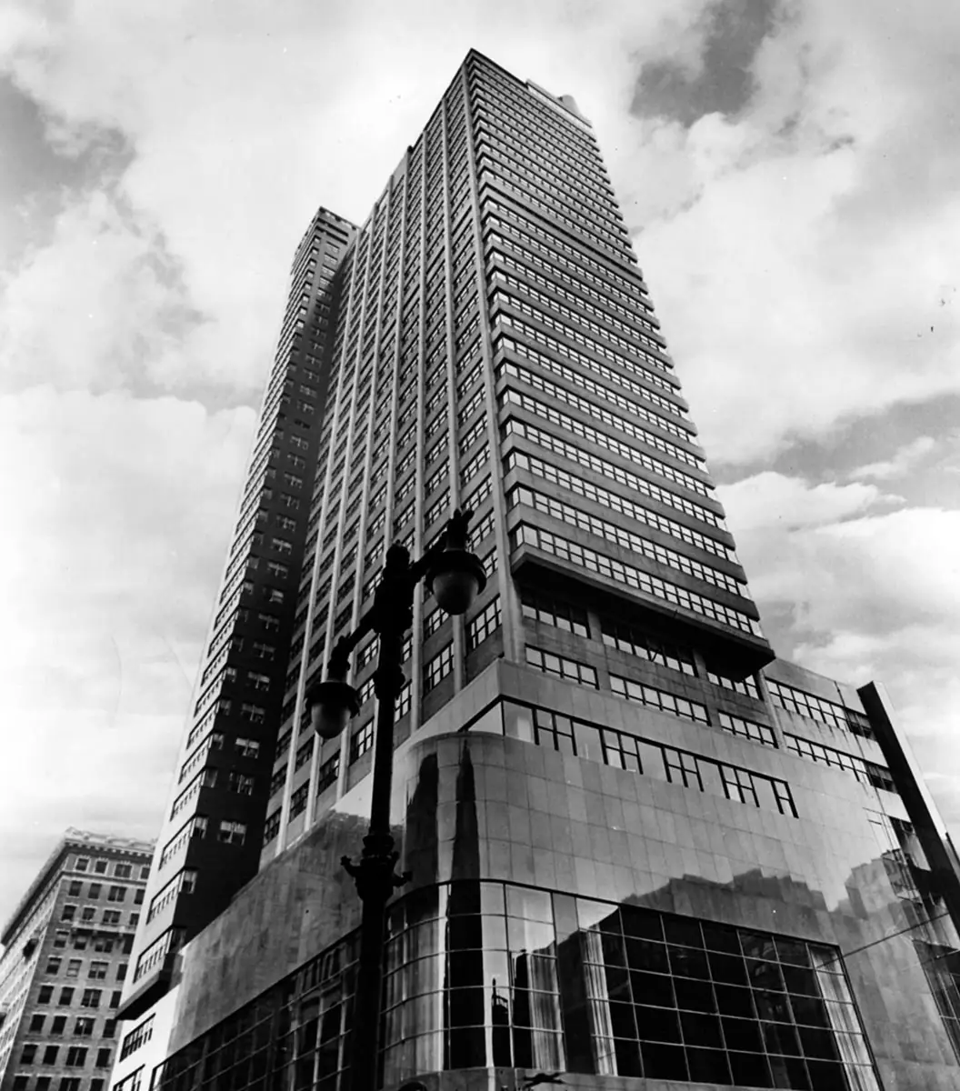
Photo courtesy PSFS
5. Philadelphia Saving Fund Society Building, Philadelphia
George Howe and William Lescaze. 1932
The back-and-forth over vertical and horizontal motifs was clearly demonstrated in the Philadelphia Saving Fund Society in Philadelphia (PSFS), designed by George Howe and William Lescaze in 1932. Of the batch of skyscrapers coming to fruition in the early 1930s, this one best captured the principles of the International Style. In an earlier scheme, Howe and Lescaze had favored a horizontal emphasis on three exposed elevations of PSFS’s tower, as part of the Modernist predilection for having bands of glass and continuous spandrels form a non-load-bearing curtain wall on the exterior of a building. They cantilevered the floors slightly beyond the columns to enhance this curtain wall feature. However, the client wanted to express a sense of verticality in the skyscraper, which the exposed columns on the exterior would do. The architects and the client reached a compromise: the columns jutted out on the long east and west sides of the slab while the horizontal curtain wall sheathed the shorter facade on Market Street.
The result spurred Douglas Haskell, in 1932, to dismiss the design as “a filing cabinet of a building. It is a stack of trays, held at the side by the vertical sticks of the rack.” The horizontal lines of the facade, he said, belonged to “intellectual baggage from Europe.” Henry-Russell Hitchcock and Philip Johnson praised PSFS in the MoMA catalogue as “an application of an aesthetically logical and consistent horizontal scheme of design to the skyscraper.” Although the building was not completed, the text noted, “The tower, with its cantilevered facade . . . is certainly admirable both as sound building and excellent architecture.”
In 1933, Lewis Mumford declared in the Sky Line column of The New Yorker that “the positive standard of beauty established by Howe & Lescaze” in PSFS’s interiors was miles above that of Rockefeller Center.
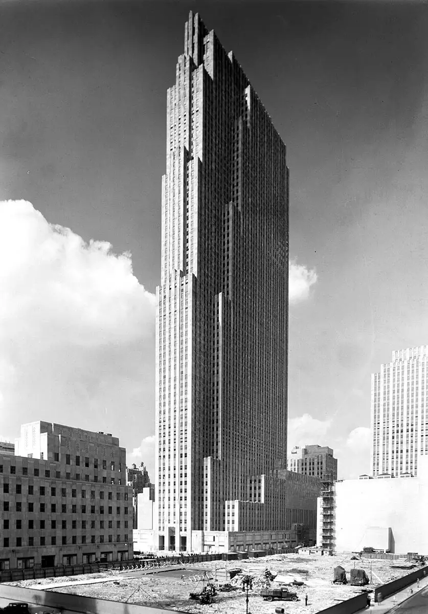
Photo © Samuel Gottscho, courtesy the Library of Congress
6. Rockefeller Center, New York
Reinhard & Hofmeister, Hood, Godley & Fouilhoux, and Corbett, Harrison & MacMurray, called Associated Architects. 1939
Today it is hard to believe that Rockefeller Center was so vilified when its plans were first presented in March 1931. Lewis Mumford writing in The New Republic called the project “weakly conceived, reckless, romantic chaos.”
When he took over as the architecture critic for the Sky Line column at The New Yorker, Mumford showed he had not mellowed since his earlier salvo in The New Republic. He claimed it to be “a plan that leads nowhere except back to the chaos from which we should like to emerge.”
The architectural journal Pencil Points declared shortly after the initial presentation: “The whole thing aroused the public as no other architectural undertaking has ever done.” Pencil Points cited a letter to The New York Times that called it “the ugliest conglomeration of buildings in New York.” Another article in Pencil Points, “A Modern Teapot Tempest,” proclaimed: “With its mouth all made up for frosted cake, the public was naturally keenly disappointed when the model revealed that it was to get only bread.”
None of the vitriol quite matched that of Ralph Adams Cram, an architect known for his Gothic leanings. In The American Mercury, he characterized Rockefeller Center as “the apotheosis of megalomania, of a defiant egotism . . . Gone also is all human scale; these raw pylons, obelisks, ovoids, and pyramids have nothing to do with man; these scarps and tall cliffs crush him and his soul as do the sheer walls of the Grand Canyon.”
The high-voltage criticism actually spurred design changes in Rockefeller Center. In April 1931, The Nation noted two aspects of this debate: the “layman has rebelled,” and “the rebellion has been effective.” Already there was a rethinking: “it is now announced that new plans are to be worked out.”
Nevertheless, Walter Lippmann, the political columnist, declared in 1933, in American Architect, that its “aesthetic aimlessness . . . is equaled only by its social irresponsibility. This collection of mammoth theaters and office buildings is being plumped down, in one of the busy and congested portions of Manhattan Island, with something like total disregard of its effects on the neighborhood.”
Although it was still under construction in 1933, Lewis Mumford, again in The New Yorker, criticized the 70-story RCA Tower: its long walls, which ran east–west, cast a large shadow to the north. The narrow portion of the tower, whose central facade was oriented east to the sunken plaza and the Channel Gardens stretching to Fifth Avenue, looked scrawny. On top of that, Mumford wrote, “the hanging gardens give the effect, from the street, of inverted mustaches.” Mumford concluded at this point that “the whole effect of the Center is mediocrity—seen through a magnifying glass.”
In the same year, Douglas Haskell couched his negative views as metaphors in The Nation. He called Rockefeller Center a “necropolis” and said the RCA tower “is tall enough to produce a sense of awe, which the dullness and drabness shade into horror.”
But a surprising development occurred. By 1939, Mumford’s perspective had become decidedly more positive. As he wrote in The New Yorker: “Purely as a visual contribution in the midtown section, this group of buildings has turned out so well that one can afford to forget about all the little stunts that have accompanied its exploitation, from the roof gardens to the rejected [Diego] Rivera murals.”
By 1940, Mumford was ready to admit he was wrong about his initial impressions of the projected plans for Rockefeller Center. Considering that not many critics confess to a change of heart, his essay for The New Yorker was surprising. Mumford still detested the hanging gardens, which may seem odd, since greenery on roofs has become so treasured today. But he concluded, “Rockefeller Center has turned into an impressive collection of structures; they form a composition in which unity and coherence have to a considerable degree diminished the fault of overemphasis.” Nevertheless, Mumford still maintained the height of the 70-story RCA Building (now 30 Rockefeller Plaza) was “the most serious aesthetic error.” He argued the center would have been “stunning” and easier to see in its entirety if the RCA tower had been kept to 32 stories, with other buildings reaching heights of eight and 16 stories.
Douglas Haskell also had a change of heart: he praised Rockefeller Center in 1966, in The Architectural Forum, saying, “It gave back to the city more space, and gave the people more art, and more joy, than any other ‘city redevelopment.’” Unlike Mumford, he made no mention of his turnabout since condemning it as a “necropolis” in 1933.
Sigfried Giedion brought up the verticality/horizontality fixation in his lectures at Harvard in 1938 and 1939 (published in 1941 as Space, Time and Architecture: The Growth of a New Tradition). The way the RCA Building’s north and south walls rose up 850 feet, with no setbacks, and turned the facades into a horizontal slab was fine: when this scale “is combined with the thinness of the structure, a certain feeling of hovering, of suspension, emanates from the surfaces.” If the Center “tyrannizes over the entire vicinity,” he wrote, “the complex presupposes not the single point of view of the Renaissance, but the many-sided approach of our own age,” a reference to his well-known space-time-continuum thesis.
Le Corbusier, writing in 1947 in his book When the Cathedrals Were White, based on his experience of skyscrapers during his visit to the U.S., in 1937, was pragmatic about Rockefeller Center: “It is rational, logically conceived, biologically normal, harmonious in its four functional elements: halls for the entrance and division of crowds, grouped shafts for vertical circulation (elevators), corridors (internal streets), regular offices.”
Manfredo Tafuri, the Italian architectural theorist and historian, commented in 1979 that this “synthesis” of several different architectural and urban strategies was not particularly inspiring. Yet, he continued, the complex “forms a worthy introduction to the surreal spectacle, the skating rink (or summer restaurant) submerged in an ordered forest of skyscrapers . . . Indeed, the deliberately restrained and ordered style of the architecture accentuates this festive mise en scene of the plaza, in which the public of midtown Manhattan participates daily.”
Critical Shifts
Now, looking back at the earlier critiques, the obsession with verticality and horizontality no longer pertains; neither is the expression of structure and program, once reflective of early modern principles, as important. They have been absorbed, forgotten, or replaced with slipcover curtain wall abstraction. Single-pitched roof angles are more common than spires and flattops. Still, some ideas remain: visibility continues to be important, since smaller, older landmarks can easily be eclipsed by new construction. Questions of urban congestion also are still a point of debate, even as buildings get taller.
One lesson can be learned: criticizing a scheme when it is first presented and not yet built, as happened with Rockefeller Center, can effect positive changes if there is a loud enough public outcry. But the medium of communicating that outcry needs to be forceful and reach an influential audience. In a digital age, when print media have often abandoned architectural criticism and social media are loosely tethered to facts or solid arguments, this may not happen. Vigilantly keeping a debate alive that awakens the public and professional consciousness is more important than ever.
This essay is an excerpt from a forthcoming book that former RECORD deputy editor Suzanne Stephens is writing on American architectural criticism in the popular press.
Looking for a reprint of this article?
From high-res PDFs to custom plaques, order your copy today!


